> ## Documentation Index
> Fetch the complete documentation index at: https://docs.thehuxdesign.com/llms.txt
> Use this file to discover all available pages before exploring further.
# Alert (Deprecated)
> This component is being renamed to Snackbar for better clarity
> **⚠️ Deprecation Notice**: This component is being renamed to "Snackbar" for better clarity and user experience. The `HuxAlert` class name in your code remains unchanged - this is just a documentation improvement.
>
> **📖 New Documentation**: See [Snackbar](/components/snackbar) for the updated and improved documentation.
>
> **🔄 Migration**: No code changes required. Your existing `HuxAlert` usage will continue to work exactly as before.
***
## Overview
**This documentation has been moved to [Snackbar](/components/snackbar).**
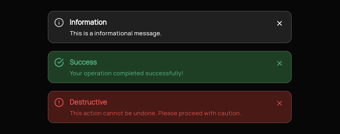
HuxAlert is a message box component that provides clear communication to users through semantic variants (info, success, error) and dismissible functionality. It automatically adapts to light and dark themes while maintaining excellent readability and accessibility.
**Please visit the [Snackbar](/components/snackbar) page for complete and up-to-date documentation.**
 ## Basic Usage
### Info Alert
```dart theme={null}
HuxAlert(
variant: HuxAlertVariant.info,
title: 'Information',
message: 'This is an informational message for the user.',
showIcon: true,
)
```
### Success Alert
```dart theme={null}
HuxAlert(
variant: HuxAlertVariant.success,
title: 'Success!',
message: 'Operation completed successfully.',
showIcon: true,
onDismiss: () {
// Handle dismissal
},
)
```
### Error Alert
```dart theme={null}
HuxAlert(
variant: HuxAlertVariant.destructive,
title: 'Error',
message: 'Something went wrong. Please try again.',
showIcon: true,
onDismiss: () {
// Handle dismissal
},
)
```
## Properties
### Core Properties
* `variant` - Alert type (info, success, destructive)
* `title` - Alert heading text
* `message` - Main alert content
* `showIcon` - Whether to display the variant icon
### Behavior Properties
* `onDismiss` - Callback when dismiss button is clicked
* `dismissible` - Whether the alert can be dismissed (default: true)
## Variants
### Info Alert (`HuxAlertVariant.info`)
* **Purpose**: General information and updates
* **Icon**: Information icon
* **Colors**: Theme-aware info colors
* **Use Case**: System updates, helpful tips, general notices
### Success Alert (`HuxAlertVariant.success`)
* **Purpose**: Positive confirmations and achievements
* **Icon**: Checkmark icon
* **Colors**: Theme-aware success colors
* **Use Case**: Form submissions, completed actions, positive feedback
### Destructive Alert (`HuxAlertVariant.destructive`)
* **Purpose**: Errors, warnings, and critical information
* **Icon**: Warning/error icon
* **Colors**: Theme-aware destructive colors
* **Use Case**: Error messages, validation failures, critical warnings
## Styling & Layout
### Dimensions
* **Max Width**: 600px (prevents overly wide alerts)
* **Padding**: Consistent internal spacing
* **Border Radius**: Rounded corners for modern appearance
### Color System
* **Background**: `HuxTokens.surfaceSuccess(context)` / `HuxTokens.surfaceDestructive(context)`
* **Text**: `HuxTokens.textSuccess(context)` / `HuxTokens.textDestructive(context)`
* **Border**: Theme-aware border colors
* **Icon**: Matches text color for consistency
### Typography
* **Title**: Prominent heading with medium weight
* **Message**: Readable body text with proper line height
* **Icon**: Appropriately sized variant icons
## States
### Default State
* Fully visible with all content
* Interactive dismiss button (if dismissible)
* Proper contrast and readability
### Dismissed State
* Smooth fade-out animation
* Removed from layout
* Callback triggered for state management
## Accessibility
### Screen Reader Support
* Proper semantic labeling
* Variant announcements
* Dismiss button descriptions
### Keyboard Navigation
* Tab key support
* Enter/Space key activation for dismiss
* Focus management
### Visual Design
* High contrast ratios
* Clear visual hierarchy
* Consistent iconography
## Examples
See HuxAlert in action within forms
Different alert variants and use cases
## Related Components
* [HuxBadge](/components/badge) - Status indicators and notification counters
* [HuxInput](/components/input) - Form input components
* [HuxButton](/components/buttons) - Action buttons for forms
## Basic Usage
### Info Alert
```dart theme={null}
HuxAlert(
variant: HuxAlertVariant.info,
title: 'Information',
message: 'This is an informational message for the user.',
showIcon: true,
)
```
### Success Alert
```dart theme={null}
HuxAlert(
variant: HuxAlertVariant.success,
title: 'Success!',
message: 'Operation completed successfully.',
showIcon: true,
onDismiss: () {
// Handle dismissal
},
)
```
### Error Alert
```dart theme={null}
HuxAlert(
variant: HuxAlertVariant.destructive,
title: 'Error',
message: 'Something went wrong. Please try again.',
showIcon: true,
onDismiss: () {
// Handle dismissal
},
)
```
## Properties
### Core Properties
* `variant` - Alert type (info, success, destructive)
* `title` - Alert heading text
* `message` - Main alert content
* `showIcon` - Whether to display the variant icon
### Behavior Properties
* `onDismiss` - Callback when dismiss button is clicked
* `dismissible` - Whether the alert can be dismissed (default: true)
## Variants
### Info Alert (`HuxAlertVariant.info`)
* **Purpose**: General information and updates
* **Icon**: Information icon
* **Colors**: Theme-aware info colors
* **Use Case**: System updates, helpful tips, general notices
### Success Alert (`HuxAlertVariant.success`)
* **Purpose**: Positive confirmations and achievements
* **Icon**: Checkmark icon
* **Colors**: Theme-aware success colors
* **Use Case**: Form submissions, completed actions, positive feedback
### Destructive Alert (`HuxAlertVariant.destructive`)
* **Purpose**: Errors, warnings, and critical information
* **Icon**: Warning/error icon
* **Colors**: Theme-aware destructive colors
* **Use Case**: Error messages, validation failures, critical warnings
## Styling & Layout
### Dimensions
* **Max Width**: 600px (prevents overly wide alerts)
* **Padding**: Consistent internal spacing
* **Border Radius**: Rounded corners for modern appearance
### Color System
* **Background**: `HuxTokens.surfaceSuccess(context)` / `HuxTokens.surfaceDestructive(context)`
* **Text**: `HuxTokens.textSuccess(context)` / `HuxTokens.textDestructive(context)`
* **Border**: Theme-aware border colors
* **Icon**: Matches text color for consistency
### Typography
* **Title**: Prominent heading with medium weight
* **Message**: Readable body text with proper line height
* **Icon**: Appropriately sized variant icons
## States
### Default State
* Fully visible with all content
* Interactive dismiss button (if dismissible)
* Proper contrast and readability
### Dismissed State
* Smooth fade-out animation
* Removed from layout
* Callback triggered for state management
## Accessibility
### Screen Reader Support
* Proper semantic labeling
* Variant announcements
* Dismiss button descriptions
### Keyboard Navigation
* Tab key support
* Enter/Space key activation for dismiss
* Focus management
### Visual Design
* High contrast ratios
* Clear visual hierarchy
* Consistent iconography
## Examples
See HuxAlert in action within forms
Different alert variants and use cases
## Related Components
* [HuxBadge](/components/badge) - Status indicators and notification counters
* [HuxInput](/components/input) - Form input components
* [HuxButton](/components/buttons) - Action buttons for forms