> ## Documentation Index
> Fetch the complete documentation index at: https://docs.thehuxdesign.com/llms.txt
> Use this file to discover all available pages before exploring further.
# Button
> Customizable button component with multiple variants, sizes, and loading states
## Overview
`HuxButton` is a versatile button component that provides multiple visual variants, sizes, loading states, and automatic WCAG AA contrast compliance. It adapts seamlessly to light and dark themes.
## Basic Usage
```dart theme={null}
HuxButton(
onPressed: () => print('Button pressed!'),
child: Text('Primary Button'),
)
```
## Variants
HuxButton supports four visual variants through the `HuxButtonVariant` enum:
### Primary
The default variant with a filled background using the primary color.
 ```dart theme={null}
HuxButton(
onPressed: () {},
child: Text('Primary'),
variant: HuxButtonVariant.primary, // Default
)
```
### Secondary
A subtle variant with a light background and border.
```dart theme={null}
HuxButton(
onPressed: () {},
child: Text('Primary'),
variant: HuxButtonVariant.primary, // Default
)
```
### Secondary
A subtle variant with a light background and border.
 ```dart theme={null}
HuxButton(
onPressed: () {},
child: Text('Secondary'),
variant: HuxButtonVariant.secondary,
)
```
### Outline
A transparent button with only a border outline.
```dart theme={null}
HuxButton(
onPressed: () {},
child: Text('Secondary'),
variant: HuxButtonVariant.secondary,
)
```
### Outline
A transparent button with only a border outline.
 ```dart theme={null}
HuxButton(
onPressed: () {},
child: Text('Outline'),
variant: HuxButtonVariant.outline,
)
```
### Ghost
A minimal transparent button without borders.
```dart theme={null}
HuxButton(
onPressed: () {},
child: Text('Outline'),
variant: HuxButtonVariant.outline,
)
```
### Ghost
A minimal transparent button without borders.
 ```dart theme={null}
HuxButton(
onPressed: () {},
child: Text('Ghost'),
variant: HuxButtonVariant.ghost,
)
```
## Sizes
Control button dimensions with three size options:
### Small
Compact size for tight spaces (32px height).
```dart theme={null}
HuxButton(
onPressed: () {},
child: Text('Ghost'),
variant: HuxButtonVariant.ghost,
)
```
## Sizes
Control button dimensions with three size options:
### Small
Compact size for tight spaces (32px height).
 ```dart theme={null}
HuxButton(
onPressed: () {},
child: Text('Small'),
size: HuxButtonSize.small,
)
```
### Medium
Default size for most use cases (40px height).
```dart theme={null}
HuxButton(
onPressed: () {},
child: Text('Small'),
size: HuxButtonSize.small,
)
```
### Medium
Default size for most use cases (40px height).
 ```dart theme={null}
HuxButton(
onPressed: () {},
child: Text('Medium'),
size: HuxButtonSize.medium, // Default
)
```
### Large
Prominent size for important actions (48px height).
```dart theme={null}
HuxButton(
onPressed: () {},
child: Text('Medium'),
size: HuxButtonSize.medium, // Default
)
```
### Large
Prominent size for important actions (48px height).
 ```dart theme={null}
HuxButton(
onPressed: () {},
child: Text('Large'),
size: HuxButtonSize.large,
)
```
## States
### Loading State
Display a loading indicator while processing.
```dart theme={null}
class LoadingButtonExample extends StatefulWidget {
@override
_LoadingButtonExampleState createState() => _LoadingButtonExampleState();
}
class _LoadingButtonExampleState extends State {
bool _isLoading = false;
void _handlePress() async {
setState(() {
_isLoading = true;
});
// Simulate async operation
await Future.delayed(Duration(seconds: 2));
setState(() {
_isLoading = false;
});
}
@override
Widget build(BuildContext context) {
return HuxButton(
onPressed: _isLoading ? null : _handlePress,
isLoading: _isLoading,
child: Text('Submit'),
);
}
}
```
### Disabled State
Disable button interaction.
```dart theme={null}
HuxButton(
onPressed: null, // or use isDisabled: true
child: Text('Disabled Button'),
isDisabled: true,
)
```
## Icons
Add icons to enhance button meaning:
### Icon with Text
```dart theme={null}
HuxButton(
onPressed: () {},
child: Text('Large'),
size: HuxButtonSize.large,
)
```
## States
### Loading State
Display a loading indicator while processing.
```dart theme={null}
class LoadingButtonExample extends StatefulWidget {
@override
_LoadingButtonExampleState createState() => _LoadingButtonExampleState();
}
class _LoadingButtonExampleState extends State {
bool _isLoading = false;
void _handlePress() async {
setState(() {
_isLoading = true;
});
// Simulate async operation
await Future.delayed(Duration(seconds: 2));
setState(() {
_isLoading = false;
});
}
@override
Widget build(BuildContext context) {
return HuxButton(
onPressed: _isLoading ? null : _handlePress,
isLoading: _isLoading,
child: Text('Submit'),
);
}
}
```
### Disabled State
Disable button interaction.
```dart theme={null}
HuxButton(
onPressed: null, // or use isDisabled: true
child: Text('Disabled Button'),
isDisabled: true,
)
```
## Icons
Add icons to enhance button meaning:
### Icon with Text
 ```dart theme={null}
HuxButton(
onPressed: () {},
child: Text('Save'),
icon: FeatherIcons.save,
)
```
### Icon-only Button
```dart theme={null}
HuxButton(
onPressed: () {},
child: Text('Save'),
icon: FeatherIcons.save,
)
```
### Icon-only Button
 ```dart theme={null}
HuxButton(
onPressed: () {},
child: Icon(FeatherIcons.heart),
size: HuxButtonSize.small,
)
```
### Square Icon-only Button
```dart theme={null}
HuxButton(
onPressed: () {},
child: SizedBox(width: 0), // Icon-only with no text
icon: FeatherIcons.heart,
size: HuxButtonSize.medium,
width: HuxButtonWidth.fixed,
widthValue: 40, // Square button: 40x40
)
```
## Width Control
Control button width behavior with the `HuxButtonWidth` enum:
### Hug Content (Default)
Button width matches its content.
```dart theme={null}
HuxButton(
onPressed: () {},
child: Icon(FeatherIcons.heart),
size: HuxButtonSize.small,
)
```
### Square Icon-only Button
```dart theme={null}
HuxButton(
onPressed: () {},
child: SizedBox(width: 0), // Icon-only with no text
icon: FeatherIcons.heart,
size: HuxButtonSize.medium,
width: HuxButtonWidth.fixed,
widthValue: 40, // Square button: 40x40
)
```
## Width Control
Control button width behavior with the `HuxButtonWidth` enum:
### Hug Content (Default)
Button width matches its content.
 ```dart theme={null}
HuxButton(
onPressed: () {},
child: Text('Short Text'),
// width: HuxButtonWidth.hug (default)
)
```
### Expand to Fill
Button takes full available width.
```dart theme={null}
HuxButton(
onPressed: () {},
child: Text('Short Text'),
// width: HuxButtonWidth.hug (default)
)
```
### Expand to Fill
Button takes full available width.
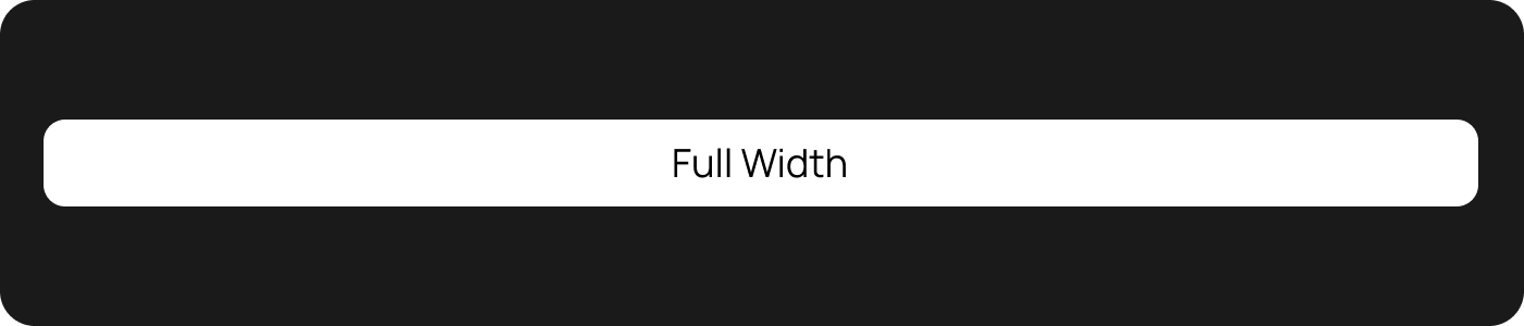 ```dart theme={null}
HuxButton(
onPressed: () {},
child: Text('Full Width'),
width: HuxButtonWidth.expand,
)
```
### Fixed Width
Button has a specific width.
```dart theme={null}
HuxButton(
onPressed: () {},
child: Text('Full Width'),
width: HuxButtonWidth.expand,
)
```
### Fixed Width
Button has a specific width.
 ```dart theme={null}
HuxButton(
onPressed: () {},
child: Text('Fixed Width'),
width: HuxButtonWidth.fixed,
widthValue: 200, // 200px width
)
```
## Custom Colors
### Using Preset Colors
```dart theme={null}
// Indigo theme
HuxButton(
onPressed: () {},
child: Text('Indigo Button'),
primaryColor: HuxColors.getPresetColor('indigo'),
)
// Green theme
HuxButton(
onPressed: () {},
child: Text('Green Button'),
primaryColor: HuxColors.getPresetColor('green'),
)
// Pink theme
HuxButton(
onPressed: () {},
child: Text('Pink Button'),
primaryColor: HuxColors.getPresetColor('pink'),
)
```
### Custom Colors
```dart theme={null}
HuxButton(
onPressed: () {},
child: Text('Custom Purple'),
primaryColor: Color(0xFF6366F1),
)
HuxButton(
onPressed: () {},
child: Text('Custom Orange'),
primaryColor: Colors.deepOrange,
)
```
## API Reference
### HuxButton Properties
| Property | Type | Default | Description |
| -------------- | ------------------ | ------------ | --------------------------------------------- |
| `onPressed` | `VoidCallback?` | **required** | Callback triggered when button is pressed |
| `child` | `Widget` | **required** | The child widget to display inside the button |
| `variant` | `HuxButtonVariant` | `primary` | Visual variant of the button |
| `size` | `HuxButtonSize` | `medium` | Size variant of the button |
| `isLoading` | `bool` | `false` | Whether to show loading indicator |
| `isDisabled` | `bool` | `false` | Whether the button is disabled |
| `icon` | `IconData?` | `null` | Optional icon to display before text |
| `primaryColor` | `Color?` | `null` | Custom primary color (overrides theme) |
### HuxButtonVariant Enum
* `HuxButtonVariant.primary` - Filled background with primary color
* `HuxButtonVariant.secondary` - Light background with border
* `HuxButtonVariant.outline` - Transparent with border only
* `HuxButtonVariant.ghost` - Transparent without border
### HuxButtonSize Enum
* `HuxButtonSize.small` - 32px height, compact padding
* `HuxButtonSize.medium` - 40px height, standard padding
* `HuxButtonSize.large` - 48px height, generous padding
## Common Patterns
### Form Buttons
```dart theme={null}
Row(
children: [
Expanded(
child: HuxButton(
onPressed: () {},
child: Text('Cancel'),
variant: HuxButtonVariant.outline,
),
),
SizedBox(width: 12),
Expanded(
child: HuxButton(
onPressed: () {},
child: Text('Submit'),
variant: HuxButtonVariant.primary,
),
),
],
)
```
### Action Buttons
```dart theme={null}
Column(
children: [
HuxButton(
onPressed: () {},
child: Text('Primary Action'),
variant: HuxButtonVariant.primary,
size: HuxButtonSize.large,
),
SizedBox(height: 12),
HuxButton(
onPressed: () {},
child: Text('Secondary Action'),
variant: HuxButtonVariant.secondary,
),
SizedBox(height: 8),
HuxButton(
onPressed: () {},
child: Text('Cancel'),
variant: HuxButtonVariant.ghost,
),
],
)
```
### Button Grid
```dart theme={null}
GridView.count(
crossAxisCount: 2,
shrinkWrap: true,
children: [
HuxButton(
onPressed: () {},
child: Column(
mainAxisAlignment: MainAxisAlignment.center,
children: [
Icon(FeatherIcons.camera),
SizedBox(height: 8),
Text('Camera'),
],
),
variant: HuxButtonVariant.outline,
),
HuxButton(
onPressed: () {},
child: Column(
mainAxisAlignment: MainAxisAlignment.center,
children: [
Icon(FeatherIcons.image),
SizedBox(height: 8),
Text('Gallery'),
],
),
variant: HuxButtonVariant.outline,
),
],
)
```
## Accessibility
HuxButton includes several accessibility features:
### Automatic Contrast
Text color is automatically calculated to ensure WCAG AA compliance (4.5:1 contrast ratio) against any background color.
### Semantic Roles
Buttons include proper semantic roles for screen readers.
### Focus States
Keyboard navigation support with visible focus indicators.
### Disabled States
Proper disabled state handling for assistive technologies.
## Best Practices
* Use **Primary** for the main action on a screen
* Use **Secondary** for important but not primary actions
* Use **Outline** for secondary actions that need visual weight
* Use **Ghost** for subtle actions like "Cancel" or "Skip"
* Use **Large** for important call-to-action buttons
* Use **Medium** for most standard interactions
* Use **Small** for compact interfaces or secondary actions
```dart theme={null}
// Always disable the button during loading
HuxButton(
onPressed: _isLoading ? null : _handlePress,
isLoading: _isLoading,
child: Text('Submit'),
)
```
* Use action-oriented labels: "Save", "Delete", "Continue"
* Avoid generic labels: "OK", "Submit", "Button"
* Keep labels concise but descriptive
## Examples
See buttons in action within forms
Learn how to handle async operations
Apply custom colors and themes
Ensure your buttons are accessible
```dart theme={null}
HuxButton(
onPressed: () {},
child: Text('Fixed Width'),
width: HuxButtonWidth.fixed,
widthValue: 200, // 200px width
)
```
## Custom Colors
### Using Preset Colors
```dart theme={null}
// Indigo theme
HuxButton(
onPressed: () {},
child: Text('Indigo Button'),
primaryColor: HuxColors.getPresetColor('indigo'),
)
// Green theme
HuxButton(
onPressed: () {},
child: Text('Green Button'),
primaryColor: HuxColors.getPresetColor('green'),
)
// Pink theme
HuxButton(
onPressed: () {},
child: Text('Pink Button'),
primaryColor: HuxColors.getPresetColor('pink'),
)
```
### Custom Colors
```dart theme={null}
HuxButton(
onPressed: () {},
child: Text('Custom Purple'),
primaryColor: Color(0xFF6366F1),
)
HuxButton(
onPressed: () {},
child: Text('Custom Orange'),
primaryColor: Colors.deepOrange,
)
```
## API Reference
### HuxButton Properties
| Property | Type | Default | Description |
| -------------- | ------------------ | ------------ | --------------------------------------------- |
| `onPressed` | `VoidCallback?` | **required** | Callback triggered when button is pressed |
| `child` | `Widget` | **required** | The child widget to display inside the button |
| `variant` | `HuxButtonVariant` | `primary` | Visual variant of the button |
| `size` | `HuxButtonSize` | `medium` | Size variant of the button |
| `isLoading` | `bool` | `false` | Whether to show loading indicator |
| `isDisabled` | `bool` | `false` | Whether the button is disabled |
| `icon` | `IconData?` | `null` | Optional icon to display before text |
| `primaryColor` | `Color?` | `null` | Custom primary color (overrides theme) |
### HuxButtonVariant Enum
* `HuxButtonVariant.primary` - Filled background with primary color
* `HuxButtonVariant.secondary` - Light background with border
* `HuxButtonVariant.outline` - Transparent with border only
* `HuxButtonVariant.ghost` - Transparent without border
### HuxButtonSize Enum
* `HuxButtonSize.small` - 32px height, compact padding
* `HuxButtonSize.medium` - 40px height, standard padding
* `HuxButtonSize.large` - 48px height, generous padding
## Common Patterns
### Form Buttons
```dart theme={null}
Row(
children: [
Expanded(
child: HuxButton(
onPressed: () {},
child: Text('Cancel'),
variant: HuxButtonVariant.outline,
),
),
SizedBox(width: 12),
Expanded(
child: HuxButton(
onPressed: () {},
child: Text('Submit'),
variant: HuxButtonVariant.primary,
),
),
],
)
```
### Action Buttons
```dart theme={null}
Column(
children: [
HuxButton(
onPressed: () {},
child: Text('Primary Action'),
variant: HuxButtonVariant.primary,
size: HuxButtonSize.large,
),
SizedBox(height: 12),
HuxButton(
onPressed: () {},
child: Text('Secondary Action'),
variant: HuxButtonVariant.secondary,
),
SizedBox(height: 8),
HuxButton(
onPressed: () {},
child: Text('Cancel'),
variant: HuxButtonVariant.ghost,
),
],
)
```
### Button Grid
```dart theme={null}
GridView.count(
crossAxisCount: 2,
shrinkWrap: true,
children: [
HuxButton(
onPressed: () {},
child: Column(
mainAxisAlignment: MainAxisAlignment.center,
children: [
Icon(FeatherIcons.camera),
SizedBox(height: 8),
Text('Camera'),
],
),
variant: HuxButtonVariant.outline,
),
HuxButton(
onPressed: () {},
child: Column(
mainAxisAlignment: MainAxisAlignment.center,
children: [
Icon(FeatherIcons.image),
SizedBox(height: 8),
Text('Gallery'),
],
),
variant: HuxButtonVariant.outline,
),
],
)
```
## Accessibility
HuxButton includes several accessibility features:
### Automatic Contrast
Text color is automatically calculated to ensure WCAG AA compliance (4.5:1 contrast ratio) against any background color.
### Semantic Roles
Buttons include proper semantic roles for screen readers.
### Focus States
Keyboard navigation support with visible focus indicators.
### Disabled States
Proper disabled state handling for assistive technologies.
## Best Practices
* Use **Primary** for the main action on a screen
* Use **Secondary** for important but not primary actions
* Use **Outline** for secondary actions that need visual weight
* Use **Ghost** for subtle actions like "Cancel" or "Skip"
* Use **Large** for important call-to-action buttons
* Use **Medium** for most standard interactions
* Use **Small** for compact interfaces or secondary actions
```dart theme={null}
// Always disable the button during loading
HuxButton(
onPressed: _isLoading ? null : _handlePress,
isLoading: _isLoading,
child: Text('Submit'),
)
```
* Use action-oriented labels: "Save", "Delete", "Continue"
* Avoid generic labels: "OK", "Submit", "Button"
* Keep labels concise but descriptive
## Examples
See buttons in action within forms
Learn how to handle async operations
Apply custom colors and themes
Ensure your buttons are accessible