> ## Documentation Index
> Fetch the complete documentation index at: https://docs.thehuxdesign.com/llms.txt
> Use this file to discover all available pages before exploring further.
# Card
> Flexible card component with headers, actions, and tap handling
## Overview
`HuxCard` provides a flexible container component for displaying content with optional headers, titles, and actions.
## Component Variants
### Basic Card
Simple card with title and content:
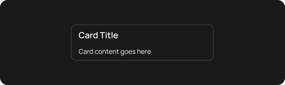 ```dart theme={null}
HuxCard(
title: 'Card Title',
child: Text('Card content goes here'),
)
```
### Card with Subtitle
Card with additional subtitle text:
```dart theme={null}
HuxCard(
title: 'Card Title',
child: Text('Card content goes here'),
)
```
### Card with Subtitle
Card with additional subtitle text:
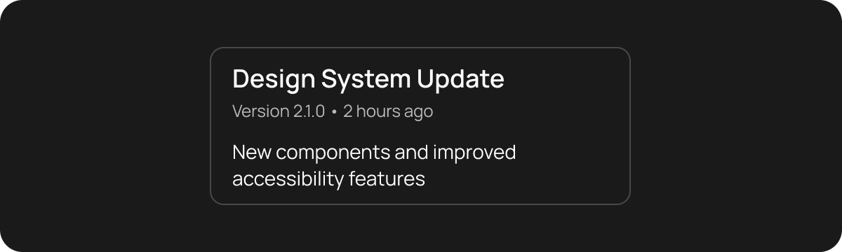 ```dart theme={null}
HuxCard(
title: 'Design System Update',
subtitle: 'Version 2.1.0 • 2 hours ago',
child: Text('New components and improved accessibility features'),
)
```
### Card with Action
Card with action button in header:
```dart theme={null}
HuxCard(
title: 'Design System Update',
subtitle: 'Version 2.1.0 • 2 hours ago',
child: Text('New components and improved accessibility features'),
)
```
### Card with Action
Card with action button in header:
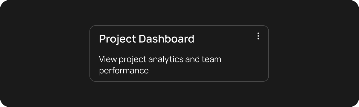 ```dart theme={null}
HuxCard(
title: 'Project Dashboard',
action: IconButton(
icon: Icon(FeatherIcons.moreVertical),
onPressed: () => _showProjectMenu(),
),
child: Text('View project analytics and team performance'),
)
```
### Interactive Card
Card with tap handling:
```dart theme={null}
HuxCard(
title: 'View Analytics',
child: Text('Tap to see detailed performance metrics'),
onTap: () => _navigateToAnalytics(),
)
```
### Nested Cards
Card containing other cards:
```dart theme={null}
HuxCard(
title: 'Parent Card',
child: Column(
children: [
HuxCard(
title: 'Child Card 1',
child: Text('Nested content'),
),
HuxCard(
title: 'Child Card 2',
child: Text('More nested content'),
),
],
),
)
```
## Basic Usage
## With Actions
```dart theme={null}
HuxCard(
title: 'Settings',
action: IconButton(
icon: Icon(FeatherIcons.settings),
onPressed: () {},
),
child: Text('Configure your preferences'),
onTap: () => print('Card tapped'),
)
```
## Properties
* `title` - Card title text
* `subtitle` - Optional subtitle text
* `action` - Optional action widget (usually IconButton)
* `child` - Main content widget
* `onTap` - Tap handler for the entire card
Complete HuxCard documentation is coming soon. See the [example app](https://github.com/lofidesigner/hux/tree/main/example) for more usage patterns.
```dart theme={null}
HuxCard(
title: 'Project Dashboard',
action: IconButton(
icon: Icon(FeatherIcons.moreVertical),
onPressed: () => _showProjectMenu(),
),
child: Text('View project analytics and team performance'),
)
```
### Interactive Card
Card with tap handling:
```dart theme={null}
HuxCard(
title: 'View Analytics',
child: Text('Tap to see detailed performance metrics'),
onTap: () => _navigateToAnalytics(),
)
```
### Nested Cards
Card containing other cards:
```dart theme={null}
HuxCard(
title: 'Parent Card',
child: Column(
children: [
HuxCard(
title: 'Child Card 1',
child: Text('Nested content'),
),
HuxCard(
title: 'Child Card 2',
child: Text('More nested content'),
),
],
),
)
```
## Basic Usage
## With Actions
```dart theme={null}
HuxCard(
title: 'Settings',
action: IconButton(
icon: Icon(FeatherIcons.settings),
onPressed: () {},
),
child: Text('Configure your preferences'),
onTap: () => print('Card tapped'),
)
```
## Properties
* `title` - Card title text
* `subtitle` - Optional subtitle text
* `action` - Optional action widget (usually IconButton)
* `child` - Main content widget
* `onTap` - Tap handler for the entire card
Complete HuxCard documentation is coming soon. See the [example app](https://github.com/lofidesigner/hux/tree/main/example) for more usage patterns.