> ## Documentation Index
> Fetch the complete documentation index at: https://docs.thehuxdesign.com/llms.txt
> Use this file to discover all available pages before exploring further.
# Chart
> Beautiful data visualization with line and bar charts
## Overview
`HuxChart` provides beautiful data visualization components powered by the cristalyse package, with automatic theme adaptation and smooth animations.
## Component Variants
### Line Charts
Display data trends over time with smooth line charts:
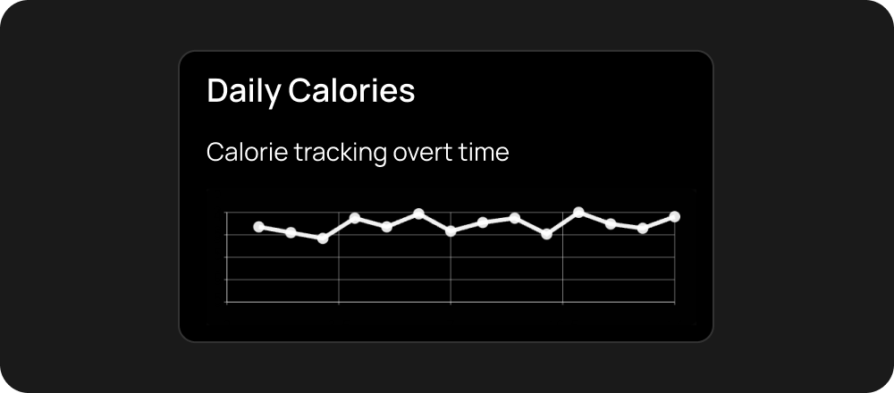 ```dart theme={null}
HuxChart.line(
data: [
{'x': 1, 'y': 10},
{'x': 2, 'y': 20},
{'x': 3, 'y': 15},
{'x': 4, 'y': 25},
],
xField: 'x',
yField: 'y',
title: 'Sales Over Time',
subtitle: 'Monthly data',
primaryColor: Colors.blue,
)
```
### Bar Charts
Visualize categorical data with responsive bar charts:
```dart theme={null}
HuxChart.line(
data: [
{'x': 1, 'y': 10},
{'x': 2, 'y': 20},
{'x': 3, 'y': 15},
{'x': 4, 'y': 25},
],
xField: 'x',
yField: 'y',
title: 'Sales Over Time',
subtitle: 'Monthly data',
primaryColor: Colors.blue,
)
```
### Bar Charts
Visualize categorical data with responsive bar charts:
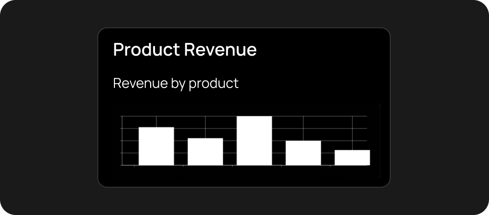 ```dart theme={null}
HuxChart.bar(
data: [
{'category': 'Product A', 'value': 30},
{'category': 'Product B', 'value': 45},
{'category': 'Product C', 'value': 25},
{'category': 'Product D', 'value': 35},
],
xField: 'category',
yField: 'value',
title: 'Product Sales',
subtitle: 'Current quarter',
)
```
### Small Charts
Compact charts for dashboards and tight spaces:
```dart theme={null}
HuxChart.line(
data: chartData,
xField: 'date',
yField: 'revenue',
size: HuxChartSize.small,
title: 'Revenue Trend',
)
```
### Large Charts
Full-size charts for detailed analysis:
```dart theme={null}
HuxChart.bar(
data: chartData,
xField: 'month',
yField: 'sales',
size: HuxChartSize.large,
title: 'Annual Sales Analysis',
subtitle: 'Detailed monthly breakdown',
)
```
### Themed Charts
Charts that automatically adapt to your app's theme:
```dart theme={null}
HuxChart.line(
data: chartData,
xField: 'date',
yField: 'users',
primaryColor: HuxTokens.primary(context),
title: 'User Growth',
)
```
## Features
* **Theme Aware** - Automatically adapts to light/dark themes
* **Responsive** - Adjusts to different screen sizes
* **Smooth Animations** - Beautiful transitions and interactions
* **Customizable Colors** - Use theme colors or custom palettes
* **Multiple Chart Types** - Line charts, bar charts, and more
## Properties
* `data` - Array of data objects
* `xField` - Field name for x-axis values
* `yField` - Field name for y-axis values
* `title` - Chart title (optional)
* `subtitle` - Chart subtitle (optional)
* `primaryColor` - Custom color override (optional)
## Data Format
Charts expect data in a simple array format:
```dart theme={null}
final chartData = [
{'date': '2024-01', 'revenue': 15000, 'users': 120},
{'date': '2024-02', 'revenue': 18000, 'users': 150},
{'date': '2024-03', 'revenue': 22000, 'users': 180},
];
```
HuxChart is powered by the [cristalyse](https://pub.dev/packages/cristalyse) package. Complete chart documentation is coming soon.
## Examples
See charts in action with real data
Build dashboards with multiple charts
```dart theme={null}
HuxChart.bar(
data: [
{'category': 'Product A', 'value': 30},
{'category': 'Product B', 'value': 45},
{'category': 'Product C', 'value': 25},
{'category': 'Product D', 'value': 35},
],
xField: 'category',
yField: 'value',
title: 'Product Sales',
subtitle: 'Current quarter',
)
```
### Small Charts
Compact charts for dashboards and tight spaces:
```dart theme={null}
HuxChart.line(
data: chartData,
xField: 'date',
yField: 'revenue',
size: HuxChartSize.small,
title: 'Revenue Trend',
)
```
### Large Charts
Full-size charts for detailed analysis:
```dart theme={null}
HuxChart.bar(
data: chartData,
xField: 'month',
yField: 'sales',
size: HuxChartSize.large,
title: 'Annual Sales Analysis',
subtitle: 'Detailed monthly breakdown',
)
```
### Themed Charts
Charts that automatically adapt to your app's theme:
```dart theme={null}
HuxChart.line(
data: chartData,
xField: 'date',
yField: 'users',
primaryColor: HuxTokens.primary(context),
title: 'User Growth',
)
```
## Features
* **Theme Aware** - Automatically adapts to light/dark themes
* **Responsive** - Adjusts to different screen sizes
* **Smooth Animations** - Beautiful transitions and interactions
* **Customizable Colors** - Use theme colors or custom palettes
* **Multiple Chart Types** - Line charts, bar charts, and more
## Properties
* `data` - Array of data objects
* `xField` - Field name for x-axis values
* `yField` - Field name for y-axis values
* `title` - Chart title (optional)
* `subtitle` - Chart subtitle (optional)
* `primaryColor` - Custom color override (optional)
## Data Format
Charts expect data in a simple array format:
```dart theme={null}
final chartData = [
{'date': '2024-01', 'revenue': 15000, 'users': 120},
{'date': '2024-02', 'revenue': 18000, 'users': 150},
{'date': '2024-03', 'revenue': 22000, 'users': 180},
];
```
HuxChart is powered by the [cristalyse](https://pub.dev/packages/cristalyse) package. Complete chart documentation is coming soon.
## Examples
See charts in action with real data
Build dashboards with multiple charts