> ## Documentation Index
> Fetch the complete documentation index at: https://docs.thehuxdesign.com/llms.txt
> Use this file to discover all available pages before exploring further.
# Checkbox
> Interactive checkbox component with smooth animations and consistent styling
## Overview
`HuxCheckbox` is an interactive checkbox component with smooth animations, consistent styling, and proper accessibility support. It automatically adapts to light and dark themes while providing a clean, professional appearance.
## Basic Usage
### Simple Checkbox
 ```dart theme={null}
HuxCheckbox(
value: isChecked,
onChanged: (value) {
setState(() {
isChecked = value ?? false;
});
},
)
```
### Checkbox with Label
```dart theme={null}
HuxCheckbox(
value: isChecked,
onChanged: (value) {
setState(() {
isChecked = value ?? false;
});
},
)
```
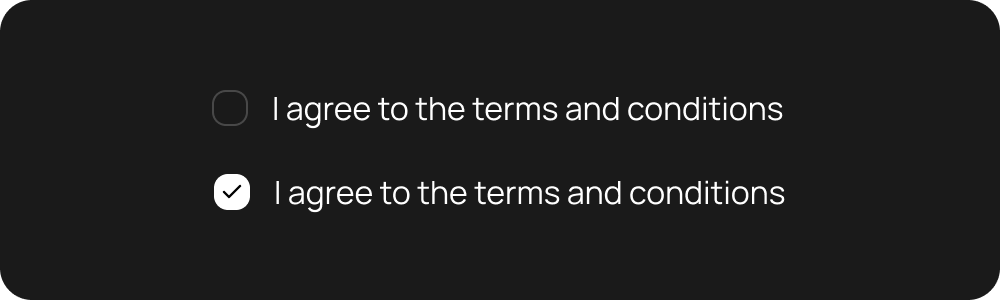
### Checkbox with Label
 ```dart theme={null}
HuxCheckbox(
value: isAgreed,
onChanged: (value) {
setState(() {
isAgreed = value ?? false;
});
},
label: 'I agree to the terms and conditions',
)
```
## Properties
### Core Properties
* `value` - Current checked state (true/false)
* `onChanged` - Callback triggered when state changes (null for disabled)
* `isDisabled` - Whether the checkbox is disabled (default: false)
### Label Properties
* `label` - Optional text label displayed next to the checkbox
### Styling Properties
* `size` - Checkbox size variant (small, medium, large)
## Size Variants
### Small Checkbox
* **Checkbox Size**: 16px × 16px
* **Icon Size**: 12px
* **Font Size**: 14px
* **Label Spacing**: 8px
### Medium Checkbox ⭐ **Default**
* **Checkbox Size**: 20px × 20px
* **Icon Size**: 14px
* **Font Size**: 16px
* **Label Spacing**: 12px
### Large Checkbox
* **Checkbox Size**: 24px × 24px
* **Icon Size**: 16px
* **Font Size**: 18px
* **Label Spacing**: 16px
## Styling & Colors
### Checkbox Colors
* **Background (Unchecked)**: `HuxTokens.surfacePrimary(context)`
* **Background (Checked)**: `HuxTokens.primary(context)`
* **Border (Unchecked)**: `HuxTokens.borderPrimary(context)`
* **Border (Checked)**: `HuxTokens.primary(context)`
* **Border (Disabled)**: `HuxTokens.borderSecondary(context)`
### Check Icon Colors
* **Check Color**: Automatically calculated for optimal contrast
* **Disabled State**: Transparent
### Text Colors
* **Label Text**: `HuxTokens.textPrimary(context)`
* **Disabled Label**: `HuxTokens.textDisabled(context)`
## States
### Unchecked State
```dart theme={null}
HuxCheckbox(
value: isAgreed,
onChanged: (value) {
setState(() {
isAgreed = value ?? false;
});
},
label: 'I agree to the terms and conditions',
)
```
## Properties
### Core Properties
* `value` - Current checked state (true/false)
* `onChanged` - Callback triggered when state changes (null for disabled)
* `isDisabled` - Whether the checkbox is disabled (default: false)
### Label Properties
* `label` - Optional text label displayed next to the checkbox
### Styling Properties
* `size` - Checkbox size variant (small, medium, large)
## Size Variants
### Small Checkbox
* **Checkbox Size**: 16px × 16px
* **Icon Size**: 12px
* **Font Size**: 14px
* **Label Spacing**: 8px
### Medium Checkbox ⭐ **Default**
* **Checkbox Size**: 20px × 20px
* **Icon Size**: 14px
* **Font Size**: 16px
* **Label Spacing**: 12px
### Large Checkbox
* **Checkbox Size**: 24px × 24px
* **Icon Size**: 16px
* **Font Size**: 18px
* **Label Spacing**: 16px
## Styling & Colors
### Checkbox Colors
* **Background (Unchecked)**: `HuxTokens.surfacePrimary(context)`
* **Background (Checked)**: `HuxTokens.primary(context)`
* **Border (Unchecked)**: `HuxTokens.borderPrimary(context)`
* **Border (Checked)**: `HuxTokens.primary(context)`
* **Border (Disabled)**: `HuxTokens.borderSecondary(context)`
### Check Icon Colors
* **Check Color**: Automatically calculated for optimal contrast
* **Disabled State**: Transparent
### Text Colors
* **Label Text**: `HuxTokens.textPrimary(context)`
* **Disabled Label**: `HuxTokens.textDisabled(context)`
## States
### Unchecked State
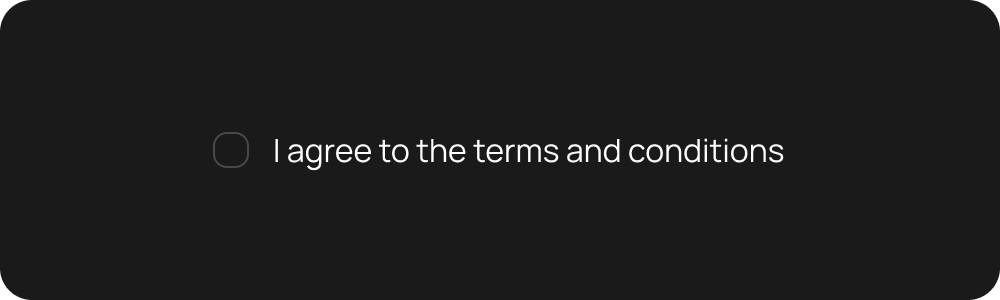 * Empty checkbox with border
* Ready for user interaction
### Checked State
* Empty checkbox with border
* Ready for user interaction
### Checked State
 * Filled checkbox with check icon
* Visual confirmation of selection
### Disabled State
* Filled checkbox with check icon
* Visual confirmation of selection
### Disabled State
 ```dart theme={null}
HuxCheckbox(
value: isChecked,
onChanged: null, // Disables the checkbox
label: 'This option is disabled',
isDisabled: true,
)
```
* Reduced opacity and non-interactive
* Maintains visual consistency
## Accessibility
### Screen Reader Support
* Proper semantic labeling
* State announcements
* Focus management
### Keyboard Navigation
* Tab key support
* Space/Enter key activation
* Focus indicators
## Examples
See HuxCheckbox in action within forms
Try different checkbox configurations
## Related Components
* [HuxInput](/components/input) - Text input component
* [HuxSwitch](/components/switch) - Toggle switch component
* [HuxDateInput](/components/date-input) - Date input component
```dart theme={null}
HuxCheckbox(
value: isChecked,
onChanged: null, // Disables the checkbox
label: 'This option is disabled',
isDisabled: true,
)
```
* Reduced opacity and non-interactive
* Maintains visual consistency
## Accessibility
### Screen Reader Support
* Proper semantic labeling
* State announcements
* Focus management
### Keyboard Navigation
* Tab key support
* Space/Enter key activation
* Focus indicators
## Examples
See HuxCheckbox in action within forms
Try different checkbox configurations
## Related Components
* [HuxInput](/components/input) - Text input component
* [HuxSwitch](/components/switch) - Toggle switch component
* [HuxDateInput](/components/date-input) - Date input component