> ## Documentation Index
> Fetch the complete documentation index at: https://docs.thehuxdesign.com/llms.txt
> Use this file to discover all available pages before exploring further.
# Date Picker
> Modern date selection with overlay calendar and theme-aware styling
## Overview
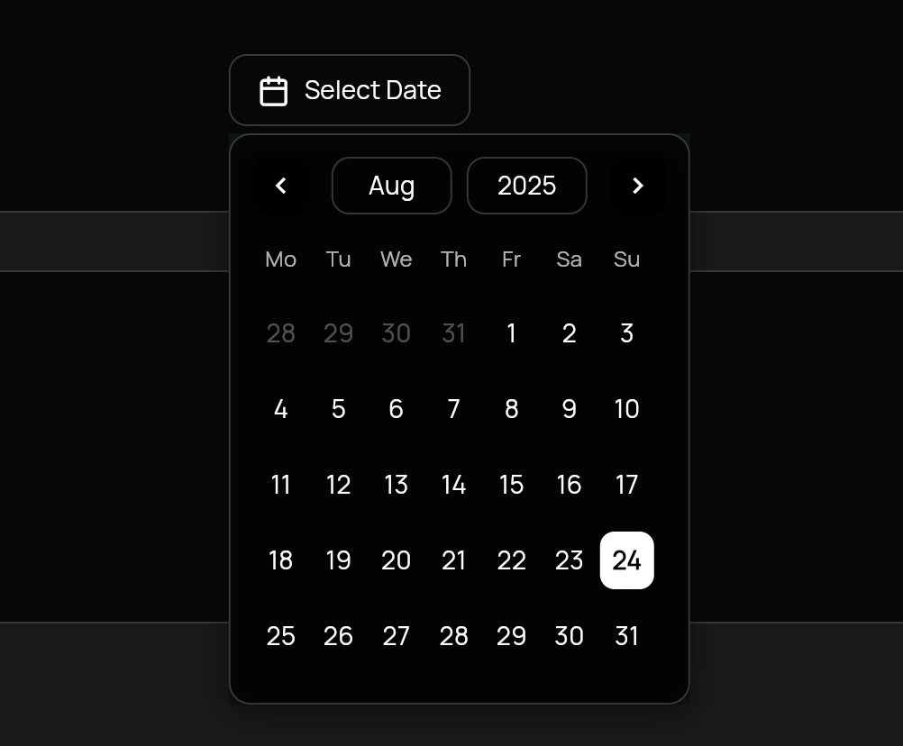
`HuxDatePicker` provides a modern date selection experience with an overlay calendar, theme-aware styling, and flexible configuration options.
 ## Basic Usage
```dart theme={null}
HuxDatePicker(
initialDate: DateTime.now(),
firstDate: DateTime(2000),
lastDate: DateTime(2100),
onDateChanged: (date) {
print('Selected date: $date');
},
placeholder: 'Select Date',
)
```
## Variants
### With Text Label
Default behavior showing both icon and text.
```dart theme={null}
HuxDatePicker(
initialDate: _selectedDate,
firstDate: DateTime(2000),
lastDate: DateTime(2100),
onDateChanged: (date) => setState(() => _selectedDate = date),
variant: HuxButtonVariant.outline,
icon: FeatherIcons.calendar,
placeholder: 'Choose Date',
)
```
### Icon Only
Compact icon-only version for tight spaces.
```dart theme={null}
HuxDatePicker(
initialDate: _selectedDate,
firstDate: DateTime(2000),
lastDate: DateTime(2100),
onDateChanged: (date) => setState(() => _selectedDate = date),
showText: false, // Icon-only mode
variant: HuxButtonVariant.ghost,
icon: FeatherIcons.calendar,
)
```
## Properties
* `initialDate` - Initially selected date
* `firstDate` - Earliest selectable date
* `lastDate` - Latest selectable date
* `onDateChanged` - Callback when date is selected
* `placeholder` - Text shown when no date is selected
* `variant` - Button visual style (HuxButtonVariant)
* `size` - Button size (HuxButtonSize)
* `icon` - Calendar icon (defaults to Icons.calendar\_today)
* `primaryColor` - Custom primary color override
* `overlayColor` - Custom overlay background color
* `showText` - Whether to show text label (default: true)
## Date Range Validation
Set boundaries for selectable dates:
```dart theme={null}
HuxDatePicker(
initialDate: DateTime.now(),
firstDate: DateTime.now().subtract(Duration(days: 365)), // 1 year ago
lastDate: DateTime.now().add(Duration(days: 365)), // 1 year from now
onDateChanged: (date) => _selectedDate = date,
placeholder: 'Select Date',
)
```
## Custom Styling
### Custom Colors
```dart theme={null}
HuxDatePicker(
initialDate: _selectedDate,
firstDate: DateTime(2000),
lastDate: DateTime(2100),
onDateChanged: (date) => _selectedDate = date,
primaryColor: Colors.deepPurple,
overlayColor: Colors.deepPurple.withOpacity(0.1),
placeholder: 'Select Date',
)
```
### Custom Icon
```dart theme={null}
HuxDatePicker(
initialDate: _selectedDate,
firstDate: DateTime(2000),
lastDate: DateTime(2100),
onDateChanged: (date) => _selectedDate = date,
icon: FeatherIcons.calendar,
placeholder: 'Pick a Date',
)
```
## Integration with Forms
Use HuxDatePicker in forms with validation:
```dart theme={null}
Form(
key: _formKey,
child: Column(
children: [
HuxDatePicker(
initialDate: _birthDate,
firstDate: DateTime(1900),
lastDate: DateTime.now(),
onDateChanged: (date) => _birthDate = date,
placeholder: 'Select Birth Date',
variant: HuxButtonVariant.outline,
),
SizedBox(height: 16),
HuxButton(
onPressed: () {
if (_birthDate != null) {
// Proceed with form submission
}
},
child: Text('Submit'),
variant: HuxButtonVariant.primary,
),
],
),
)
```
## Features
* **Overlay Calendar** - Modern calendar interface that appears below the button
* **Smart Positioning** - Automatically adjusts position to prevent screen overflow
* **Theme Aware** - Seamlessly adapts to light and dark themes
* **Date Validation** - Enforces date range constraints
* **Keyboard Navigation** - Arrow keys and Enter/Space for calendar/header interactions
* **Tab Focus Cycling** - Tab navigation stays within picker regions (calendar/header) while open
* **Bounded Month/Year Navigation** - Month/year views and focus state are clamped to `firstDate..lastDate`
* **Flexible Styling** - Multiple button variants and size options
* **Icon Only Mode** - Compact display for space-constrained layouts
For more examples, see the [full example app](https://github.com/lofidesigner/hux/tree/main/example) and [Basic Usage](/examples/basic-usage) guide.
## Basic Usage
```dart theme={null}
HuxDatePicker(
initialDate: DateTime.now(),
firstDate: DateTime(2000),
lastDate: DateTime(2100),
onDateChanged: (date) {
print('Selected date: $date');
},
placeholder: 'Select Date',
)
```
## Variants
### With Text Label
Default behavior showing both icon and text.
```dart theme={null}
HuxDatePicker(
initialDate: _selectedDate,
firstDate: DateTime(2000),
lastDate: DateTime(2100),
onDateChanged: (date) => setState(() => _selectedDate = date),
variant: HuxButtonVariant.outline,
icon: FeatherIcons.calendar,
placeholder: 'Choose Date',
)
```
### Icon Only
Compact icon-only version for tight spaces.
```dart theme={null}
HuxDatePicker(
initialDate: _selectedDate,
firstDate: DateTime(2000),
lastDate: DateTime(2100),
onDateChanged: (date) => setState(() => _selectedDate = date),
showText: false, // Icon-only mode
variant: HuxButtonVariant.ghost,
icon: FeatherIcons.calendar,
)
```
## Properties
* `initialDate` - Initially selected date
* `firstDate` - Earliest selectable date
* `lastDate` - Latest selectable date
* `onDateChanged` - Callback when date is selected
* `placeholder` - Text shown when no date is selected
* `variant` - Button visual style (HuxButtonVariant)
* `size` - Button size (HuxButtonSize)
* `icon` - Calendar icon (defaults to Icons.calendar\_today)
* `primaryColor` - Custom primary color override
* `overlayColor` - Custom overlay background color
* `showText` - Whether to show text label (default: true)
## Date Range Validation
Set boundaries for selectable dates:
```dart theme={null}
HuxDatePicker(
initialDate: DateTime.now(),
firstDate: DateTime.now().subtract(Duration(days: 365)), // 1 year ago
lastDate: DateTime.now().add(Duration(days: 365)), // 1 year from now
onDateChanged: (date) => _selectedDate = date,
placeholder: 'Select Date',
)
```
## Custom Styling
### Custom Colors
```dart theme={null}
HuxDatePicker(
initialDate: _selectedDate,
firstDate: DateTime(2000),
lastDate: DateTime(2100),
onDateChanged: (date) => _selectedDate = date,
primaryColor: Colors.deepPurple,
overlayColor: Colors.deepPurple.withOpacity(0.1),
placeholder: 'Select Date',
)
```
### Custom Icon
```dart theme={null}
HuxDatePicker(
initialDate: _selectedDate,
firstDate: DateTime(2000),
lastDate: DateTime(2100),
onDateChanged: (date) => _selectedDate = date,
icon: FeatherIcons.calendar,
placeholder: 'Pick a Date',
)
```
## Integration with Forms
Use HuxDatePicker in forms with validation:
```dart theme={null}
Form(
key: _formKey,
child: Column(
children: [
HuxDatePicker(
initialDate: _birthDate,
firstDate: DateTime(1900),
lastDate: DateTime.now(),
onDateChanged: (date) => _birthDate = date,
placeholder: 'Select Birth Date',
variant: HuxButtonVariant.outline,
),
SizedBox(height: 16),
HuxButton(
onPressed: () {
if (_birthDate != null) {
// Proceed with form submission
}
},
child: Text('Submit'),
variant: HuxButtonVariant.primary,
),
],
),
)
```
## Features
* **Overlay Calendar** - Modern calendar interface that appears below the button
* **Smart Positioning** - Automatically adjusts position to prevent screen overflow
* **Theme Aware** - Seamlessly adapts to light and dark themes
* **Date Validation** - Enforces date range constraints
* **Keyboard Navigation** - Arrow keys and Enter/Space for calendar/header interactions
* **Tab Focus Cycling** - Tab navigation stays within picker regions (calendar/header) while open
* **Bounded Month/Year Navigation** - Month/year views and focus state are clamped to `firstDate..lastDate`
* **Flexible Styling** - Multiple button variants and size options
* **Icon Only Mode** - Compact display for space-constrained layouts
For more examples, see the [full example app](https://github.com/lofidesigner/hux/tree/main/example) and [Basic Usage](/examples/basic-usage) guide.