> ## Documentation Index
> Fetch the complete documentation index at: https://docs.thehuxdesign.com/llms.txt
> Use this file to discover all available pages before exploring further.
# Dialog
> Modal dialogs with Hux styling and consistent theming
## Overview
HuxDialog is a customizable dialog component that provides a consistent modal experience with optional header, content, and action buttons. The dialog automatically adapts to light and dark themes and provides a clean, modern appearance with proper spacing and accessibility.
## Component Variants
### Basic Dialog
 Simple dialog with title and content:
```dart theme={null}
HuxDialog(
title: 'Basic Dialog',
content: Text('This is a basic dialog with Hux styling.'),
actions: [
HuxButton(
onPressed: () => Navigator.of(context).pop(),
child: Text('Close'),
variant: HuxButtonVariant.secondary,
),
],
)
```
### Confirmation Dialog
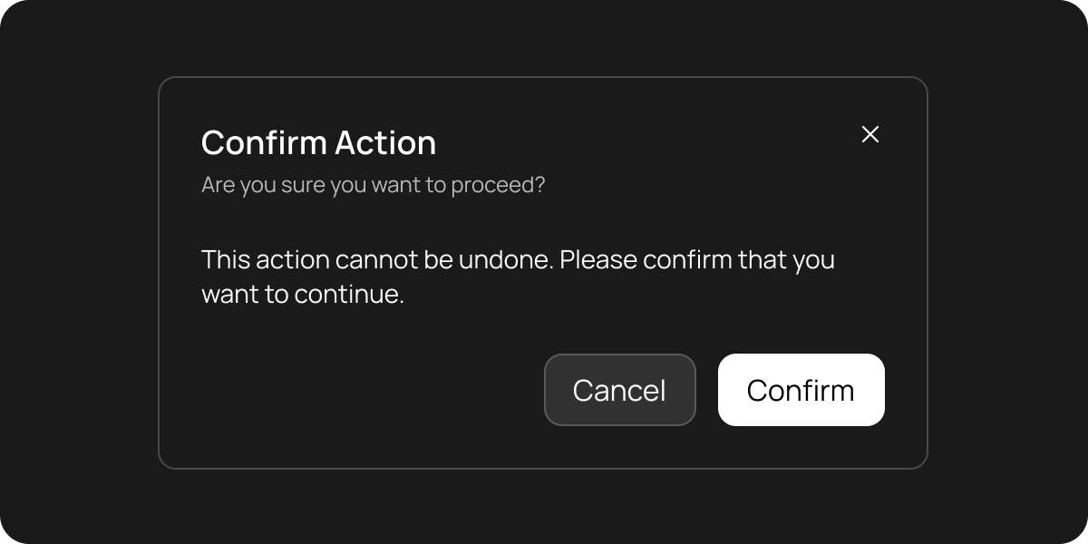
Dialog for confirming important actions:
```dart theme={null}
HuxDialog(
title: 'Confirm Action',
subtitle: 'Are you sure you want to proceed?',
content: Text('This action cannot be undone. Please confirm that you want to continue.'),
actions: [
HuxButton(
onPressed: () => Navigator.of(context).pop(false),
child: Text('Cancel'),
variant: HuxButtonVariant.secondary,
),
HuxButton(
onPressed: () => Navigator.of(context).pop(true),
child: Text('Confirm'),
),
],
)
```
### Large Dialog
Dialog with extensive content:
```dart theme={null}
HuxDialog(
title: 'Large Dialog',
subtitle: 'This dialog demonstrates the large size variant',
size: HuxDialogSize.large,
content: Column(
crossAxisAlignment: CrossAxisAlignment.start,
mainAxisSize: MainAxisSize.min,
children: [
Text('This is a large dialog with more content.'),
SizedBox(height: 16),
Text('You can include multiple paragraphs, forms, or other widgets here.'),
],
),
actions: [
HuxButton(
onPressed: () => Navigator.of(context).pop(),
child: Text('Close'),
variant: HuxButtonVariant.secondary,
),
HuxButton(
onPressed: () => Navigator.of(context).pop(),
child: Text('Save'),
),
],
)
```
## Size Variants
### Small Dialog
Compact dialog for simple confirmations:
```dart theme={null}
HuxDialog(
size: HuxDialogSize.small,
title: 'Quick Confirm',
content: Text('Are you sure?'),
actions: [
HuxButton(
onPressed: () => Navigator.of(context).pop(false),
child: Text('No'),
variant: HuxButtonVariant.secondary,
),
HuxButton(
onPressed: () => Navigator.of(context).pop(true),
child: Text('Yes'),
),
],
)
```
### Medium Dialog
Standard dialog size (default):
```dart theme={null}
HuxDialog(
size: HuxDialogSize.medium, // Default
title: 'Standard Dialog',
content: Text('This is the default medium size.'),
)
```
### Large Dialog
Spacious dialog for complex content:
```dart theme={null}
HuxDialog(
size: HuxDialogSize.large,
title: 'Complex Dialog',
content: Column(
children: [
Text('Multiple sections'),
SizedBox(height: 16),
Text('Forms and widgets'),
SizedBox(height: 16),
Text('Extended content'),
],
),
)
```
### Extra Large Dialog
Maximum size for extensive content:
```dart theme={null}
HuxDialog(
size: HuxDialogSize.extraLarge,
title: 'Full Screen Dialog',
content: Container(
height: 400,
child: ListView.builder(
itemCount: 20,
itemBuilder: (context, index) => ListTile(
title: Text('Item ${index + 1}'),
),
),
),
)
```
## Using showHuxDialog
For convenience, Hux provides a `showHuxDialog` function that wraps the dialog in a `showDialog` call:
```dart theme={null}
final bool? result = await showHuxDialog(
context: context,
title: 'Confirm Action',
content: Text('Are you sure?'),
actions: [
HuxButton(
onPressed: () => Navigator.of(context).pop(false),
child: Text('Cancel'),
variant: HuxButtonVariant.secondary,
),
HuxButton(
onPressed: () => Navigator.of(context).pop(true),
child: Text('Confirm'),
),
],
);
if (result == true) {
// User confirmed
print('Action confirmed');
}
```
## Properties
### Core Properties
* `title` - Optional title text displayed in the dialog header
* `subtitle` - Optional subtitle text displayed below the title
* `content` - The main content widget to display in the dialog body
* `actions` - Optional list of action buttons displayed at the bottom
### Appearance Properties
* `variant` - Visual variant of the dialog (default, destructive, success, warning)
* `size` - Size variant of the dialog (small, medium, large, extraLarge)
* `showCloseButton` - Whether to show a close button in the header (default: true)
### Behavior Properties
* `barrierDismissible` - Whether the dialog can be dismissed by tapping outside
* `clipBehavior` - How to clip the dialog content
* `shape` - Custom shape for the dialog
* `insetPadding` - Padding around the dialog content
## Styling & Layout
### Dimensions
* **Small**: Max width 400px, min width 300px
* **Medium**: Max width 500px, min width 350px (default)
* **Large**: Max width 700px, min width 500px
* **Extra Large**: Max width 900px, min width 700px
### Color System
* **Background**: `HuxTokens.surfaceElevated(context)`
* **Text**: `HuxTokens.textPrimary(context)` and `HuxTokens.textSecondary(context)`
* **Borders**: `HuxTokens.borderPrimary(context)` and `HuxTokens.borderSecondary(context)`
* **Shadows**: `HuxTokens.shadowColor(context)` with proper opacity
### Typography
* **Title**: 18-24px with medium weight (based on size)
* **Subtitle**: 14px with secondary text color
* **Content**: Inherits from theme
## Accessibility
### Screen Reader Support
* Proper semantic labeling for dialog content
* Title and subtitle announcements
* Action button descriptions
### Keyboard Navigation
* Tab key support for action buttons
* Enter/Space key activation
* Escape key dismissal (when barrierDismissible is true)
### Focus Management
* Automatic focus on first action button
* Proper focus trapping within dialog
* Focus restoration on dialog close
## Best Practices
* Use **Small** for simple confirmations
* Use **Medium** for standard content (default)
* Use **Large** for forms or complex content
* Use **Extra Large** for extensive content or full-screen experiences
* Place primary actions on the right
* Use secondary variant for cancel/dismiss actions
* Limit to 2-3 action buttons for clarity
* Use clear, action-oriented button text
* Keep titles concise and descriptive
* Use subtitles for additional context
* Structure content with proper spacing
* Consider mobile screen sizes
* Provide meaningful titles and subtitles
* Use semantic button labels
* Ensure proper contrast ratios
* Test with screen readers
## Examples
Create dialogs with form inputs and validation
Build multi-step confirmation processes
Show rich content in modal dialogs
Customize dialog appearance and behavior
## Related Components
* [HuxButton](/components/buttons) - Action buttons for dialogs
* [HuxCard](/components/cards) - Content containers
* [HuxInput](/components/input) - Form inputs within dialogs
* [HuxAlert](/components/alert) - Non-modal feedback messages
Simple dialog with title and content:
```dart theme={null}
HuxDialog(
title: 'Basic Dialog',
content: Text('This is a basic dialog with Hux styling.'),
actions: [
HuxButton(
onPressed: () => Navigator.of(context).pop(),
child: Text('Close'),
variant: HuxButtonVariant.secondary,
),
],
)
```
### Confirmation Dialog
Dialog for confirming important actions:
```dart theme={null}
HuxDialog(
title: 'Confirm Action',
subtitle: 'Are you sure you want to proceed?',
content: Text('This action cannot be undone. Please confirm that you want to continue.'),
actions: [
HuxButton(
onPressed: () => Navigator.of(context).pop(false),
child: Text('Cancel'),
variant: HuxButtonVariant.secondary,
),
HuxButton(
onPressed: () => Navigator.of(context).pop(true),
child: Text('Confirm'),
),
],
)
```
### Large Dialog
Dialog with extensive content:
```dart theme={null}
HuxDialog(
title: 'Large Dialog',
subtitle: 'This dialog demonstrates the large size variant',
size: HuxDialogSize.large,
content: Column(
crossAxisAlignment: CrossAxisAlignment.start,
mainAxisSize: MainAxisSize.min,
children: [
Text('This is a large dialog with more content.'),
SizedBox(height: 16),
Text('You can include multiple paragraphs, forms, or other widgets here.'),
],
),
actions: [
HuxButton(
onPressed: () => Navigator.of(context).pop(),
child: Text('Close'),
variant: HuxButtonVariant.secondary,
),
HuxButton(
onPressed: () => Navigator.of(context).pop(),
child: Text('Save'),
),
],
)
```
## Size Variants
### Small Dialog
Compact dialog for simple confirmations:
```dart theme={null}
HuxDialog(
size: HuxDialogSize.small,
title: 'Quick Confirm',
content: Text('Are you sure?'),
actions: [
HuxButton(
onPressed: () => Navigator.of(context).pop(false),
child: Text('No'),
variant: HuxButtonVariant.secondary,
),
HuxButton(
onPressed: () => Navigator.of(context).pop(true),
child: Text('Yes'),
),
],
)
```
### Medium Dialog
Standard dialog size (default):
```dart theme={null}
HuxDialog(
size: HuxDialogSize.medium, // Default
title: 'Standard Dialog',
content: Text('This is the default medium size.'),
)
```
### Large Dialog
Spacious dialog for complex content:
```dart theme={null}
HuxDialog(
size: HuxDialogSize.large,
title: 'Complex Dialog',
content: Column(
children: [
Text('Multiple sections'),
SizedBox(height: 16),
Text('Forms and widgets'),
SizedBox(height: 16),
Text('Extended content'),
],
),
)
```
### Extra Large Dialog
Maximum size for extensive content:
```dart theme={null}
HuxDialog(
size: HuxDialogSize.extraLarge,
title: 'Full Screen Dialog',
content: Container(
height: 400,
child: ListView.builder(
itemCount: 20,
itemBuilder: (context, index) => ListTile(
title: Text('Item ${index + 1}'),
),
),
),
)
```
## Using showHuxDialog
For convenience, Hux provides a `showHuxDialog` function that wraps the dialog in a `showDialog` call:
```dart theme={null}
final bool? result = await showHuxDialog(
context: context,
title: 'Confirm Action',
content: Text('Are you sure?'),
actions: [
HuxButton(
onPressed: () => Navigator.of(context).pop(false),
child: Text('Cancel'),
variant: HuxButtonVariant.secondary,
),
HuxButton(
onPressed: () => Navigator.of(context).pop(true),
child: Text('Confirm'),
),
],
);
if (result == true) {
// User confirmed
print('Action confirmed');
}
```
## Properties
### Core Properties
* `title` - Optional title text displayed in the dialog header
* `subtitle` - Optional subtitle text displayed below the title
* `content` - The main content widget to display in the dialog body
* `actions` - Optional list of action buttons displayed at the bottom
### Appearance Properties
* `variant` - Visual variant of the dialog (default, destructive, success, warning)
* `size` - Size variant of the dialog (small, medium, large, extraLarge)
* `showCloseButton` - Whether to show a close button in the header (default: true)
### Behavior Properties
* `barrierDismissible` - Whether the dialog can be dismissed by tapping outside
* `clipBehavior` - How to clip the dialog content
* `shape` - Custom shape for the dialog
* `insetPadding` - Padding around the dialog content
## Styling & Layout
### Dimensions
* **Small**: Max width 400px, min width 300px
* **Medium**: Max width 500px, min width 350px (default)
* **Large**: Max width 700px, min width 500px
* **Extra Large**: Max width 900px, min width 700px
### Color System
* **Background**: `HuxTokens.surfaceElevated(context)`
* **Text**: `HuxTokens.textPrimary(context)` and `HuxTokens.textSecondary(context)`
* **Borders**: `HuxTokens.borderPrimary(context)` and `HuxTokens.borderSecondary(context)`
* **Shadows**: `HuxTokens.shadowColor(context)` with proper opacity
### Typography
* **Title**: 18-24px with medium weight (based on size)
* **Subtitle**: 14px with secondary text color
* **Content**: Inherits from theme
## Accessibility
### Screen Reader Support
* Proper semantic labeling for dialog content
* Title and subtitle announcements
* Action button descriptions
### Keyboard Navigation
* Tab key support for action buttons
* Enter/Space key activation
* Escape key dismissal (when barrierDismissible is true)
### Focus Management
* Automatic focus on first action button
* Proper focus trapping within dialog
* Focus restoration on dialog close
## Best Practices
* Use **Small** for simple confirmations
* Use **Medium** for standard content (default)
* Use **Large** for forms or complex content
* Use **Extra Large** for extensive content or full-screen experiences
* Place primary actions on the right
* Use secondary variant for cancel/dismiss actions
* Limit to 2-3 action buttons for clarity
* Use clear, action-oriented button text
* Keep titles concise and descriptive
* Use subtitles for additional context
* Structure content with proper spacing
* Consider mobile screen sizes
* Provide meaningful titles and subtitles
* Use semantic button labels
* Ensure proper contrast ratios
* Test with screen readers
## Examples
Create dialogs with form inputs and validation
Build multi-step confirmation processes
Show rich content in modal dialogs
Customize dialog appearance and behavior
## Related Components
* [HuxButton](/components/buttons) - Action buttons for dialogs
* [HuxCard](/components/cards) - Content containers
* [HuxInput](/components/input) - Form inputs within dialogs
* [HuxAlert](/components/alert) - Non-modal feedback messages