> ## Documentation Index
> Fetch the complete documentation index at: https://docs.thehuxdesign.com/llms.txt
> Use this file to discover all available pages before exploring further.
# Snackbar
> Temporary notification messages with semantic variants and dismissible functionality
## Overview
HuxSnackbar is a message box component that provides clear communication to users through semantic variants (info, success, error) and dismissible functionality. It features a modern glassmorphism design with backdrop blur effects that automatically adapts to light and dark themes while maintaining excellent readability and accessibility.
### Key Features
* **Glassmorphism Design**: Modern frosted glass effect with backdrop blur
* **Fixed Width**: Consistent 400px width positioned at bottom-left
* **Theme-Adaptive**: Different blur intensities for light (5px) and dark (10px) modes
* **Semantic Variants**: Info, success, error, and warning states
* **Auto-positioning**: Floating behavior with proper margins
* **Optional actions**: Add interactive buttons like “Undo”
* **Optional stacking**: Show multiple snackbars at once using the overlay controller
## Component Variants
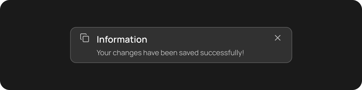
### Info Snackbar
Informational messages with blue styling:
 ```dart theme={null}
HuxSnackbar(
message: 'Your changes have been saved successfully!',
variant: HuxSnackbarVariant.info,
onDismiss: () => print('Dismissed'),
)
```
### Success Snackbar
Positive confirmation messages with green styling:
```dart theme={null}
HuxSnackbar(
message: 'Your changes have been saved successfully!',
variant: HuxSnackbarVariant.info,
onDismiss: () => print('Dismissed'),
)
```
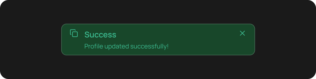
### Success Snackbar
Positive confirmation messages with green styling:
 ```dart theme={null}
HuxSnackbar(
message: 'Profile updated successfully!',
variant: HuxSnackbarVariant.success,
onDismiss: () => print('Dismissed'),
)
```
### Error Snackbar
Error messages with red styling:
```dart theme={null}
HuxSnackbar(
message: 'Profile updated successfully!',
variant: HuxSnackbarVariant.success,
onDismiss: () => print('Dismissed'),
)
```
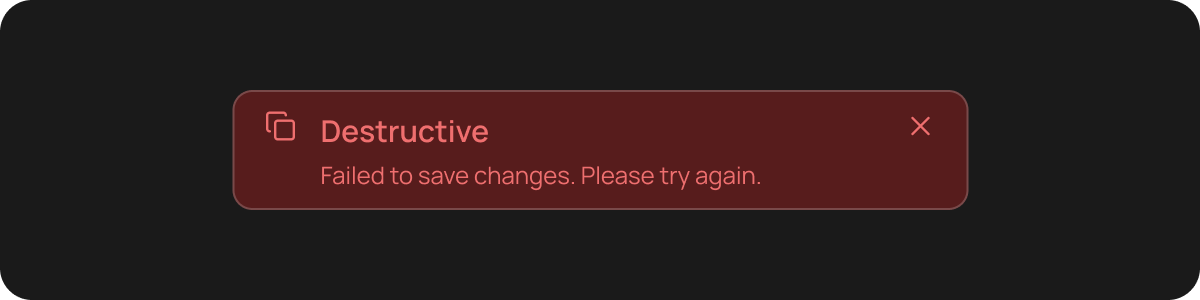
### Error Snackbar
Error messages with red styling:
 ```dart theme={null}
HuxSnackbar(
message: 'Failed to save changes. Please try again.',
variant: HuxSnackbarVariant.error,
onDismiss: () => print('Dismissed'),
)
```
### Warning Snackbar
Warning messages with orange styling:
```dart theme={null}
HuxSnackbar(
message: 'You have unsaved changes. Save before leaving?',
variant: HuxSnackbarVariant.warning,
onDismiss: () => print('Dismissed'),
)
```
## Basic Usage
### Simple Snackbar (via extension)
Show a snackbar from any widget with a `BuildContext`:
```dart theme={null}
context.showHuxSnackbar(message: 'This is a simple snackbar message');
```
### Dismissible Snackbar
Snackbar that can be dismissed by the user:
```dart theme={null}
context.showHuxSnackbar(
message: 'Click the X to dismiss this message',
onDismiss: () => print('Snackbar dismissed'),
);
```
### Snackbar with Actions (Undo / Retry / View)
Add one or more action buttons (for example, “Undo”):
```dart theme={null}
context.showHuxSnackbar(
message: 'Item deleted',
variant: HuxSnackbarVariant.info,
actions: [
HuxSnackbarAction(
label: 'Undo',
onPressed: () {
// Restore the item
},
),
],
);
```
### Stacking multiple snackbars (overlay)
Flutter’s `ScaffoldMessenger` queues snackbars. To **stack** multiple snackbars (show them simultaneously), use the overlay controller:
```dart theme={null}
HuxSnackbarStackController.of(context).show(
const HuxSnackbar(
message: 'Saved',
duration: Duration(seconds: 4),
),
);
HuxSnackbarStackController.of(context).show(
const HuxSnackbar(
message: 'Synced',
duration: Duration(seconds: 4),
),
);
```
## Properties
### HuxSnackbar Properties
| Property | Type | Default | Description |
| ----------- | -------------------------- | ------------ | ----------------------------------------------- |
| `message` | `String` | **required** | The message text to display |
| `variant` | `HuxSnackbarVariant` | `info` | Visual variant of the snackbar |
| `title` | `String?` | `null` | Optional title displayed above the message |
| `onDismiss` | `VoidCallback?` | `null` | Callback when dismiss button is pressed |
| `duration` | `Duration` | `4 seconds` | Duration the snackbar is displayed |
| `showIcon` | `bool` | `true` | Whether to show an icon in the snackbar |
| `actions` | `List?` | `null` | Optional action buttons (Undo/Retry/Close/etc.) |
### HuxSnackbarAction Properties
| Property | Type | Default | Description |
| ----------- | -------------- | ------------ | ----------------------------- |
| `label` | `String` | **required** | Button label (e.g. `"Undo"`) |
| `onPressed` | `VoidCallback` | **required** | Callback when pressed |
| `textColor` | `Color?` | `null` | Optional label color override |
### HuxSnackbarVariant Enum
* `HuxSnackbarVariant.info` - Blue styling for informational messages
* `HuxSnackbarVariant.success` - Green styling for success confirmations
* `HuxSnackbarVariant.error` - Red styling for error messages
* `HuxSnackbarVariant.warning` - Orange styling for warning messages
## Styling
### Custom Colors
Override default colors for specific use cases:
```dart theme={null}
HuxSnackbar(
message: 'Custom styled snackbar',
variant: HuxSnackbarVariant.info,
backgroundColor: Colors.deepPurple,
textColor: Colors.white,
)
```
## Colors
### Theme-Aware Colors
Snackbar automatically adapts to light and dark themes:
* **Info**: Blue tones with appropriate contrast
* **Success**: Green tones with appropriate contrast
* **Error**: Red tones with appropriate contrast
* **Warning**: Orange tones with appropriate contrast
## States
### Default State
Normal snackbar appearance with all interactive elements enabled.
### Dismissed State
Snackbar is removed from the UI after user interaction or auto-dismiss.
### Loading State
For future enhancement - snackbar with loading indicator.
## Accessibility
HuxSnackbar includes several accessibility features:
### Screen Reader Support
* Message content is properly announced
* Dismiss button includes appropriate labels
### Keyboard Navigation
* Tab navigation to dismiss button
* Enter/Space key support for dismissal
* Escape key support for quick dismissal
### High Contrast Support
* Colors automatically adjust for high contrast themes
* Maintains WCAG AA compliance (4.5:1 contrast ratio)
## Best Practices
* Use **Info** for general information and updates
* Use **Success** for positive confirmations and achievements
* Use **Error** for actual errors that need user attention
* Use **Warning** for potential issues or important notices
* Keep messages concise (under 2 lines when possible)
* Use clear, action-oriented language
* Avoid technical jargon unless necessary
* Use auto-dismiss for informational messages (3-5 seconds)
* Keep error messages visible until user dismisses
* Consider user reading time for longer messages
* Position at the top or bottom of the screen
* Avoid covering important content
* Consider mobile keyboard visibility
## Examples
Show success/error messages after form submission
Display system updates and user alerts
Confirm successful operations and actions
Gracefully handle and display errors
## Related Components
* [HuxInput](/components/input) - Form input components
* [HuxButton](/components/buttons) - Action buttons for forms
* [HuxBadge](/components/badge) - Status indicators
* [HuxCard](/components/cards) - Content containers
```dart theme={null}
HuxSnackbar(
message: 'Failed to save changes. Please try again.',
variant: HuxSnackbarVariant.error,
onDismiss: () => print('Dismissed'),
)
```
### Warning Snackbar
Warning messages with orange styling:
```dart theme={null}
HuxSnackbar(
message: 'You have unsaved changes. Save before leaving?',
variant: HuxSnackbarVariant.warning,
onDismiss: () => print('Dismissed'),
)
```
## Basic Usage
### Simple Snackbar (via extension)
Show a snackbar from any widget with a `BuildContext`:
```dart theme={null}
context.showHuxSnackbar(message: 'This is a simple snackbar message');
```
### Dismissible Snackbar
Snackbar that can be dismissed by the user:
```dart theme={null}
context.showHuxSnackbar(
message: 'Click the X to dismiss this message',
onDismiss: () => print('Snackbar dismissed'),
);
```
### Snackbar with Actions (Undo / Retry / View)
Add one or more action buttons (for example, “Undo”):
```dart theme={null}
context.showHuxSnackbar(
message: 'Item deleted',
variant: HuxSnackbarVariant.info,
actions: [
HuxSnackbarAction(
label: 'Undo',
onPressed: () {
// Restore the item
},
),
],
);
```
### Stacking multiple snackbars (overlay)
Flutter’s `ScaffoldMessenger` queues snackbars. To **stack** multiple snackbars (show them simultaneously), use the overlay controller:
```dart theme={null}
HuxSnackbarStackController.of(context).show(
const HuxSnackbar(
message: 'Saved',
duration: Duration(seconds: 4),
),
);
HuxSnackbarStackController.of(context).show(
const HuxSnackbar(
message: 'Synced',
duration: Duration(seconds: 4),
),
);
```
## Properties
### HuxSnackbar Properties
| Property | Type | Default | Description |
| ----------- | -------------------------- | ------------ | ----------------------------------------------- |
| `message` | `String` | **required** | The message text to display |
| `variant` | `HuxSnackbarVariant` | `info` | Visual variant of the snackbar |
| `title` | `String?` | `null` | Optional title displayed above the message |
| `onDismiss` | `VoidCallback?` | `null` | Callback when dismiss button is pressed |
| `duration` | `Duration` | `4 seconds` | Duration the snackbar is displayed |
| `showIcon` | `bool` | `true` | Whether to show an icon in the snackbar |
| `actions` | `List?` | `null` | Optional action buttons (Undo/Retry/Close/etc.) |
### HuxSnackbarAction Properties
| Property | Type | Default | Description |
| ----------- | -------------- | ------------ | ----------------------------- |
| `label` | `String` | **required** | Button label (e.g. `"Undo"`) |
| `onPressed` | `VoidCallback` | **required** | Callback when pressed |
| `textColor` | `Color?` | `null` | Optional label color override |
### HuxSnackbarVariant Enum
* `HuxSnackbarVariant.info` - Blue styling for informational messages
* `HuxSnackbarVariant.success` - Green styling for success confirmations
* `HuxSnackbarVariant.error` - Red styling for error messages
* `HuxSnackbarVariant.warning` - Orange styling for warning messages
## Styling
### Custom Colors
Override default colors for specific use cases:
```dart theme={null}
HuxSnackbar(
message: 'Custom styled snackbar',
variant: HuxSnackbarVariant.info,
backgroundColor: Colors.deepPurple,
textColor: Colors.white,
)
```
## Colors
### Theme-Aware Colors
Snackbar automatically adapts to light and dark themes:
* **Info**: Blue tones with appropriate contrast
* **Success**: Green tones with appropriate contrast
* **Error**: Red tones with appropriate contrast
* **Warning**: Orange tones with appropriate contrast
## States
### Default State
Normal snackbar appearance with all interactive elements enabled.
### Dismissed State
Snackbar is removed from the UI after user interaction or auto-dismiss.
### Loading State
For future enhancement - snackbar with loading indicator.
## Accessibility
HuxSnackbar includes several accessibility features:
### Screen Reader Support
* Message content is properly announced
* Dismiss button includes appropriate labels
### Keyboard Navigation
* Tab navigation to dismiss button
* Enter/Space key support for dismissal
* Escape key support for quick dismissal
### High Contrast Support
* Colors automatically adjust for high contrast themes
* Maintains WCAG AA compliance (4.5:1 contrast ratio)
## Best Practices
* Use **Info** for general information and updates
* Use **Success** for positive confirmations and achievements
* Use **Error** for actual errors that need user attention
* Use **Warning** for potential issues or important notices
* Keep messages concise (under 2 lines when possible)
* Use clear, action-oriented language
* Avoid technical jargon unless necessary
* Use auto-dismiss for informational messages (3-5 seconds)
* Keep error messages visible until user dismisses
* Consider user reading time for longer messages
* Position at the top or bottom of the screen
* Avoid covering important content
* Consider mobile keyboard visibility
## Examples
Show success/error messages after form submission
Display system updates and user alerts
Confirm successful operations and actions
Gracefully handle and display errors
## Related Components
* [HuxInput](/components/input) - Form input components
* [HuxButton](/components/buttons) - Action buttons for forms
* [HuxBadge](/components/badge) - Status indicators
* [HuxCard](/components/cards) - Content containers