> ## Documentation Index
> Fetch the complete documentation index at: https://docs.thehuxdesign.com/llms.txt
> Use this file to discover all available pages before exploring further.
# Hux UI
> An open-source state of the art UI library for Flutter 💙
 ## What is Hux UI?
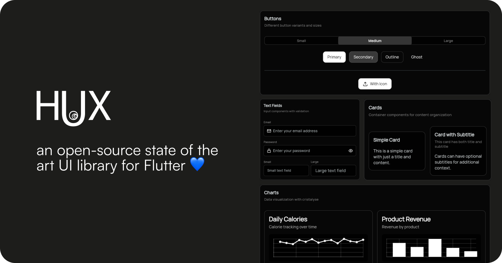
Hux UI is an open-source state-of-the-art UI library for Flutter, created by [Zoe Gilbert](https://github.com/lofidesigner). It provides a comprehensive set of beautiful, customizable components designed for clean and consistent user interfaces.
**Try it live!** Explore all Hux UI components interactively at [ui.thehuxdesign.com](https://ui.thehuxdesign.com) 🚀
**Designers**: Access the complete Hux UI design system in [Figma](https://www.figma.com/community/file/1541197128732135637/the-hux-ui) with all components, colors, and design tokens ready for your design workflow.
Try all Hux UI components interactively in your browser
Install Hux UI and set up your first Flutter app in minutes
Explore our comprehensive collection of UI components
See Hux UI in action with practical examples
Learn how to customize themes and design tokens
Access the complete design system for your design workflow
## Key Features
Clean, minimal design language with beautiful animations and smooth interactions.
Built-in light and dark theme support with automatic adaptation and design tokens.
Beautiful animated charts for data presentation with line and bar chart support.
Components adapt to different screen sizes and provide excellent cross-platform support.
Extensive customization options with design tokens and theme system.
WCAG AA compliant with proper contrast ratios and accessibility features.
## Available Components
Hux UI includes 25+ carefully crafted components organized into logical categories:
### Input & Forms
* **HuxButton** - Multiple variants (primary, secondary, outline, ghost) with loading states and icon-only support
* **HuxInput** - Enhanced text input with validation and consistent styling
* **HuxTextarea** - Multi-line text input optimized for longer content with character count support
* **HuxDateInput** - Date input with automatic formatting and calendar picker
* **HuxCheckbox** - Interactive checkbox with custom styling and labels
* **HuxSwitch** - Toggle switch with smooth animations
### Date & Time Selection
* **HuxDatePicker** - Modern date picker with overlay calendar and icon-only mode
* **HuxDateInput** - Integrated date input with automatic formatting
### Layout & Display
* **HuxCard** - Flexible card component with headers, actions, and tap handling
* **HuxTabs** - Organize content into multiple panels with tab navigation
* **HuxAvatar** - Circular user images with initials fallback and gradient variants
* **HuxAvatarGroup** - Display multiple avatars with overlapping layouts
### Feedback & Status
* **HuxBadge** - Status indicators with semantic variants
* **HuxAlert** - Message boxes with dismissible functionality
* **HuxLoading** - Customizable loading indicators and overlays
### Advanced Components
* **HuxChart** - Beautiful data visualization with cristalyse integration
* **HuxContextMenu** - Right-click context menus with smart positioning
### Theme System
* **HuxTheme** - Pre-configured light and dark themes
* **HuxColors** - Comprehensive color palette
* **HuxTokens** - Design token system for consistent theming
## Quick Example
```dart theme={null}
import 'package:flutter/material.dart';
import 'package:hux/hux.dart';
void main() {
runApp(MyApp());
}
class MyApp extends StatelessWidget {
@override
Widget build(BuildContext context) {
return MaterialApp(
title: 'Hux UI Demo',
theme: HuxTheme.lightTheme,
darkTheme: HuxTheme.darkTheme,
home: Scaffold(
body: Column(
children: [
HuxButton(
onPressed: () => print('Hello Hux!'),
child: Text('Get Started'),
variant: HuxButtonVariant.primary,
),
HuxInput(
label: 'Your Name',
hint: 'Enter your name',
),
HuxDateInput(
label: 'Birth Date',
onDateChanged: (date) => print('Selected: $date'),
),
HuxCard(
title: 'Welcome to Hux UI',
subtitle: 'Build beautiful Flutter apps',
child: Text('Start creating amazing user interfaces'),
),
],
),
),
);
}
}
```
## Support Hux UI
If you find Hux UI helpful and would like to support its continued development, consider becoming a GitHub Sponsor! 🌟
Your support helps us:
* 🚀 Maintain and improve Hux UI components
* 📚 Create better documentation and examples
* 🐛 Fix bugs and add new features faster
* 💡 Invest in new component development
[**Become a GitHub Sponsor**](https://github.com/sponsors/lofidesigner) - Every contribution makes a difference!
***
## Links
* **Live Demo**: [ui.thehuxdesign.com](https://ui.thehuxdesign.com) - Interactive component playground
* **Package**: [pub.dev/packages/hux](https://pub.dev/packages/hux)
* **Source Code**: [github.com/lofidesigner/hux](https://github.com/lofidesigner/hux)
* **Issues**: [GitHub Issues](https://github.com/lofidesigner/hux/issues)
* **Documentation**: [docs.thehuxdesign.com](https://docs.thehuxdesign.com)
* **Figma Library**: [Figma Community](https://www.figma.com/community/file/1541197128732135637/the-hux-ui)
* **Changelog**: [GitHub Releases](https://github.com/lofidesigner/hux/releases)
## What is Hux UI?
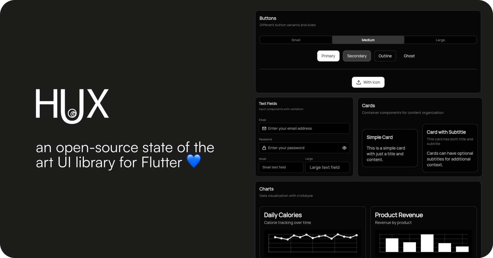
Hux UI is an open-source state-of-the-art UI library for Flutter, created by [Zoe Gilbert](https://github.com/lofidesigner). It provides a comprehensive set of beautiful, customizable components designed for clean and consistent user interfaces.
**Try it live!** Explore all Hux UI components interactively at [ui.thehuxdesign.com](https://ui.thehuxdesign.com) 🚀
**Designers**: Access the complete Hux UI design system in [Figma](https://www.figma.com/community/file/1541197128732135637/the-hux-ui) with all components, colors, and design tokens ready for your design workflow.
Try all Hux UI components interactively in your browser
Install Hux UI and set up your first Flutter app in minutes
Explore our comprehensive collection of UI components
See Hux UI in action with practical examples
Learn how to customize themes and design tokens
Access the complete design system for your design workflow
## Key Features
Clean, minimal design language with beautiful animations and smooth interactions.
Built-in light and dark theme support with automatic adaptation and design tokens.
Beautiful animated charts for data presentation with line and bar chart support.
Components adapt to different screen sizes and provide excellent cross-platform support.
Extensive customization options with design tokens and theme system.
WCAG AA compliant with proper contrast ratios and accessibility features.
## Available Components
Hux UI includes 25+ carefully crafted components organized into logical categories:
### Input & Forms
* **HuxButton** - Multiple variants (primary, secondary, outline, ghost) with loading states and icon-only support
* **HuxInput** - Enhanced text input with validation and consistent styling
* **HuxTextarea** - Multi-line text input optimized for longer content with character count support
* **HuxDateInput** - Date input with automatic formatting and calendar picker
* **HuxCheckbox** - Interactive checkbox with custom styling and labels
* **HuxSwitch** - Toggle switch with smooth animations
### Date & Time Selection
* **HuxDatePicker** - Modern date picker with overlay calendar and icon-only mode
* **HuxDateInput** - Integrated date input with automatic formatting
### Layout & Display
* **HuxCard** - Flexible card component with headers, actions, and tap handling
* **HuxTabs** - Organize content into multiple panels with tab navigation
* **HuxAvatar** - Circular user images with initials fallback and gradient variants
* **HuxAvatarGroup** - Display multiple avatars with overlapping layouts
### Feedback & Status
* **HuxBadge** - Status indicators with semantic variants
* **HuxAlert** - Message boxes with dismissible functionality
* **HuxLoading** - Customizable loading indicators and overlays
### Advanced Components
* **HuxChart** - Beautiful data visualization with cristalyse integration
* **HuxContextMenu** - Right-click context menus with smart positioning
### Theme System
* **HuxTheme** - Pre-configured light and dark themes
* **HuxColors** - Comprehensive color palette
* **HuxTokens** - Design token system for consistent theming
## Quick Example
```dart theme={null}
import 'package:flutter/material.dart';
import 'package:hux/hux.dart';
void main() {
runApp(MyApp());
}
class MyApp extends StatelessWidget {
@override
Widget build(BuildContext context) {
return MaterialApp(
title: 'Hux UI Demo',
theme: HuxTheme.lightTheme,
darkTheme: HuxTheme.darkTheme,
home: Scaffold(
body: Column(
children: [
HuxButton(
onPressed: () => print('Hello Hux!'),
child: Text('Get Started'),
variant: HuxButtonVariant.primary,
),
HuxInput(
label: 'Your Name',
hint: 'Enter your name',
),
HuxDateInput(
label: 'Birth Date',
onDateChanged: (date) => print('Selected: $date'),
),
HuxCard(
title: 'Welcome to Hux UI',
subtitle: 'Build beautiful Flutter apps',
child: Text('Start creating amazing user interfaces'),
),
],
),
),
);
}
}
```
## Support Hux UI
If you find Hux UI helpful and would like to support its continued development, consider becoming a GitHub Sponsor! 🌟
Your support helps us:
* 🚀 Maintain and improve Hux UI components
* 📚 Create better documentation and examples
* 🐛 Fix bugs and add new features faster
* 💡 Invest in new component development
[**Become a GitHub Sponsor**](https://github.com/sponsors/lofidesigner) - Every contribution makes a difference!
***
## Links
* **Live Demo**: [ui.thehuxdesign.com](https://ui.thehuxdesign.com) - Interactive component playground
* **Package**: [pub.dev/packages/hux](https://pub.dev/packages/hux)
* **Source Code**: [github.com/lofidesigner/hux](https://github.com/lofidesigner/hux)
* **Issues**: [GitHub Issues](https://github.com/lofidesigner/hux/issues)
* **Documentation**: [docs.thehuxdesign.com](https://docs.thehuxdesign.com)
* **Figma Library**: [Figma Community](https://www.figma.com/community/file/1541197128732135637/the-hux-ui)
* **Changelog**: [GitHub Releases](https://github.com/lofidesigner/hux/releases)