Overview
HuxButton is a versatile button component that provides multiple visual variants, sizes, loading states, and automatic WCAG AA contrast compliance. It adapts seamlessly to light and dark themes.
Basic Usage
Variants
HuxButton supports four visual variants through theHuxButtonVariant enum:
Primary
The default variant with a filled background using the primary color.
Secondary
A subtle variant with a light background and border.
Outline
A transparent button with only a border outline.
Ghost
A minimal transparent button without borders.
Sizes
Control button dimensions with three size options:Small
Compact size for tight spaces (32px height).
Medium
Default size for most use cases (40px height).
Large
Prominent size for important actions (48px height).
States
Loading State
Display a loading indicator while processing.Disabled State
Disable button interaction.Icons
Add icons to enhance button meaning:Icon with Text
Icon-only Button
Square Icon-only Button
Width Control
Control button width behavior with theHuxButtonWidth enum:
Hug Content (Default)
Button width matches its content.
Expand to Fill
Button takes full available width.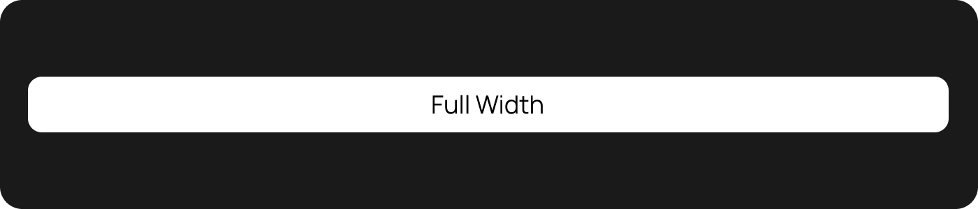
Fixed Width
Button has a specific width.
Custom Colors
Using Preset Colors
Custom Colors
API Reference
HuxButton Properties
HuxButtonVariant Enum
HuxButtonVariant.primary- Filled background with primary colorHuxButtonVariant.secondary- Light background with borderHuxButtonVariant.outline- Transparent with border onlyHuxButtonVariant.ghost- Transparent without border
HuxButtonSize Enum
HuxButtonSize.small- 32px height, compact paddingHuxButtonSize.medium- 40px height, standard paddingHuxButtonSize.large- 48px height, generous padding
Common Patterns
Form Buttons
Action Buttons
Button Grid
Accessibility
HuxButton includes several accessibility features:Automatic Contrast
Text color is automatically calculated to ensure WCAG AA compliance (4.5:1 contrast ratio) against any background color.Semantic Roles
Buttons include proper semantic roles for screen readers.Focus States
Keyboard navigation support with visible focus indicators.Disabled States
Proper disabled state handling for assistive technologies.Best Practices
Choose the Right Variant
Choose the Right Variant
- Use Primary for the main action on a screen
- Use Secondary for important but not primary actions
- Use Outline for secondary actions that need visual weight
- Use Ghost for subtle actions like “Cancel” or “Skip”
Size Appropriately
Size Appropriately
- Use Large for important call-to-action buttons
- Use Medium for most standard interactions
- Use Small for compact interfaces or secondary actions
Loading States
Loading States
Clear Labels
Clear Labels
- Use action-oriented labels: “Save”, “Delete”, “Continue”
- Avoid generic labels: “OK”, “Submit”, “Button”
- Keep labels concise but descriptive
Examples
Form Building
See buttons in action within forms
Loading States
Learn how to handle async operations
Custom Theming
Apply custom colors and themes
Accessibility
Ensure your buttons are accessible