Overview
HuxChart provides beautiful data visualization components powered by the cristalyse package, with automatic theme adaptation and smooth animations.
Component Variants
Line Charts
Display data trends over time with smooth line charts: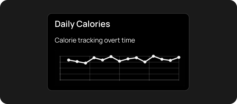
Bar Charts
Visualize categorical data with responsive bar charts: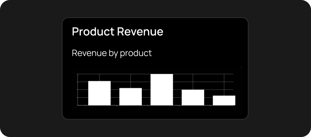
Small Charts
Compact charts for dashboards and tight spaces:Large Charts
Full-size charts for detailed analysis:Themed Charts
Charts that automatically adapt to your app’s theme:Features
- Theme Aware - Automatically adapts to light/dark themes
- Responsive - Adjusts to different screen sizes
- Smooth Animations - Beautiful transitions and interactions
- Customizable Colors - Use theme colors or custom palettes
- Multiple Chart Types - Line charts, bar charts, and more
Properties
data- Array of data objectsxField- Field name for x-axis valuesyField- Field name for y-axis valuestitle- Chart title (optional)subtitle- Chart subtitle (optional)primaryColor- Custom color override (optional)
Data Format
Charts expect data in a simple array format:HuxChart is powered by the cristalyse package. Complete chart documentation is coming soon.
Examples
Data Visualization
See charts in action with real data
Dashboard
Build dashboards with multiple charts