Overview
HuxCard provides a flexible container component for displaying content with optional headers, titles, and actions.
Component Variants
Basic Card
Simple card with title and content:
Card with Subtitle
Card with additional subtitle text: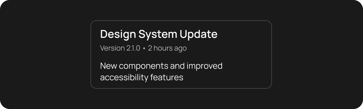
Card with Action
Card with action button in header:
Interactive Card
Card with tap handling:Nested Cards
Card containing other cards:Basic Usage
With Actions
Properties
title- Card title textsubtitle- Optional subtitle textaction- Optional action widget (usually IconButton)child- Main content widgetonTap- Tap handler for the entire card
Complete HuxCard documentation is coming soon. See the example app for more usage patterns.