Overview
HuxSnackbar is a message box component that provides clear communication to users through semantic variants (info, success, error) and dismissible functionality. It features a modern glassmorphism design with backdrop blur effects that automatically adapts to light and dark themes while maintaining excellent readability and accessibility.Key Features
- Glassmorphism Design: Modern frosted glass effect with backdrop blur
- Fixed Width: Consistent 400px width positioned at bottom-left
- Theme-Adaptive: Different blur intensities for light (5px) and dark (10px) modes
- Semantic Variants: Info, success, error, and warning states
- Auto-positioning: Floating behavior with proper margins
- Optional actions: Add interactive buttons like “Undo”
- Optional stacking: Show multiple snackbars at once using the overlay controller
Component Variants
Info Snackbar
Informational messages with blue styling: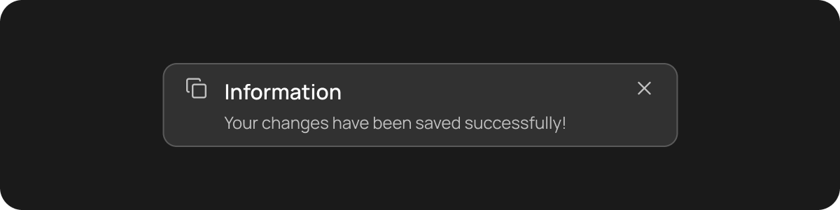
Success Snackbar
Positive confirmation messages with green styling: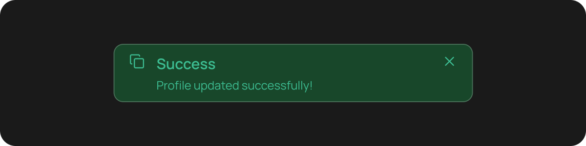
Error Snackbar
Error messages with red styling: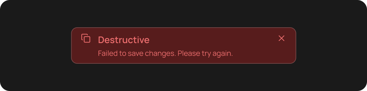
Warning Snackbar
Warning messages with orange styling:Basic Usage
Simple Snackbar (via extension)
Show a snackbar from any widget with aBuildContext:
Dismissible Snackbar
Snackbar that can be dismissed by the user:Snackbar with Actions (Undo / Retry / View)
Add one or more action buttons (for example, “Undo”):Stacking multiple snackbars (overlay)
Flutter’sScaffoldMessenger queues snackbars. To stack multiple snackbars (show them simultaneously), use the overlay controller:
Properties
HuxSnackbar Properties
HuxSnackbarAction Properties
HuxSnackbarVariant Enum
HuxSnackbarVariant.info- Blue styling for informational messagesHuxSnackbarVariant.success- Green styling for success confirmationsHuxSnackbarVariant.error- Red styling for error messagesHuxSnackbarVariant.warning- Orange styling for warning messages
Styling
Custom Colors
Override default colors for specific use cases:Colors
Theme-Aware Colors
Snackbar automatically adapts to light and dark themes:- Info: Blue tones with appropriate contrast
- Success: Green tones with appropriate contrast
- Error: Red tones with appropriate contrast
- Warning: Orange tones with appropriate contrast
States
Default State
Normal snackbar appearance with all interactive elements enabled.Dismissed State
Snackbar is removed from the UI after user interaction or auto-dismiss.Loading State
For future enhancement - snackbar with loading indicator.Accessibility
HuxSnackbar includes several accessibility features:Screen Reader Support
- Message content is properly announced
- Dismiss button includes appropriate labels
Keyboard Navigation
- Tab navigation to dismiss button
- Enter/Space key support for dismissal
- Escape key support for quick dismissal
High Contrast Support
- Colors automatically adjust for high contrast themes
- Maintains WCAG AA compliance (4.5:1 contrast ratio)
Best Practices
Choose the Right Variant
Choose the Right Variant
- Use Info for general information and updates
- Use Success for positive confirmations and achievements
- Use Error for actual errors that need user attention
- Use Warning for potential issues or important notices
Message Length
Message Length
- Keep messages concise (under 2 lines when possible)
- Use clear, action-oriented language
- Avoid technical jargon unless necessary
Timing
Timing
- Use auto-dismiss for informational messages (3-5 seconds)
- Keep error messages visible until user dismisses
- Consider user reading time for longer messages
Placement
Placement
- Position at the top or bottom of the screen
- Avoid covering important content
- Consider mobile keyboard visibility
Examples
Form Feedback
Show success/error messages after form submission
User Notifications
Display system updates and user alerts
Action Confirmations
Confirm successful operations and actions
Error Handling
Gracefully handle and display errors